Chapter Thirteen Organization and presentation of data
Introduction
The summary and interpretation of data from quantitative research entail the use of statistics. We use statistics to organize and interpret research observations and measurements. A statistic is also a number that is obtained by the mathematical manipulation of the research data. Descriptive statistics describe characteristics of the researcher’s data.
In previous chapters we examined how interviews, observations and measurement are used to produce data in clinical investigations or research. It can be difficult to make sense of raw data when they consist of a large number of measurements. Before we can interpret or communicate the information provided by a research project, the raw data must be organized and presented in a clear and intelligible fashion. We do this using statistics. The aim of this chapter is to outline methods used in descriptive statistics for the organization, tabulation and graphic presentation of data. We will also examine the use of some simple statistics directly derived from the tabulation of the data.
The aims of this chapter are to:
The organization and presentation of nominal or ordinal data
A fundamental consideration in selecting appropriate statistics is the question of whether the data are discrete or continuous. Nominal and ordinal data are necessarily discrete, so that the organization of the data involves counting the number (frequency) of cases falling into each category of measurement. Let us examine two simple examples as an illustration.
Organization of discrete data
Example 1: nominal data
We are interested in the sex of patients (nominal data) undergoing gall bladder surgery (cholecyst-ectomy) at a public hospital over a period of one year. The raw data indicating the sex (M or F) of the patients is simply read off the patients’ records, as follows:
F, M, M, F, F, F, M, F, M, F, M, F, F, F, F, F, F, F, F, F, M, F, F, F, M, M, F, M, F, M
Grouping the above nominal data involves counting the number of cases (or measurements) falling into each category. The total is M = 10 and F = 20. The data can be presented in tabular form. Table 13.1 shows the following conventions in tabulating data:
Table 13.1 Frequency distribution of gender of patients undergoing cholecystectomy at a hospital over a period of 1 year
| Gender | f |
|---|---|
| Males (M) | 10 |
| Females (F) | 20 |
| n = 30 |
Example 2: ordinal data
Ordinal data are presented by counting the number of cases (frequency) of each ordered rank making up the scale.
An investigator intends to evaluate the effectiveness of a new analgesic versus placebo treatment. A post-test only control group design is used: the experimental group receives the analgesic and the control group the placebo. Twenty patients are randomly assigned into each of the two groups. Pain intensity is assessed by the patients’ pain reports five hours after minor surgery, on the following scale:
After tallying the results, the above data can be presented as a frequency distribution, as shown in Table 13.2. This demonstrates that when the data have been tabulated, we can see the outcome of the investigation. Here, the pain reported by the experimental group is less than that of the control group.
Table 13.2 Reported pain intensity of patients following placebo and analgesic treatments
| Pain intensity | Experimental group (analgesic) | Control group (placebo) |
|---|---|---|
| f | f | |
| 1 | 2 | 0 |
| 2 | 3 | 2 |
| 3 | 10 | 3 |
| 4 | 3 | 10 |
| 5 | 2 | 5 |
| n = 20 | n = 20 |
Graphing discrete data
Once a frequency distribution of the raw data has been tabulated, a variety of techniques is available for the pictorial or graphical presentation of a given set of measurements. Frequency distributions of qualitative data are often plotted as bar graphs (also termed ‘column’ graphs), or shown pictorially as pie diagrams.
A bar graph involves plotting the frequency of each category and drawing a bar, the height of which represents the frequency of a given category. Figure 13.1 graphs the data given in Table 13.1.
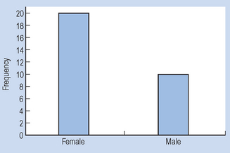
Figure 13.1 demonstrates conventions in plotting bar graphs:
It should be noted that care must be exercised in interpreting graphs, as the axes may be translated or compressed causing a false visual impression of the data. Make sure that you inspect the values along the axes, so that you are not misled. It is also acceptable to calculate the percentage of scores falling into each category and to display the percentages instead of frequencies.
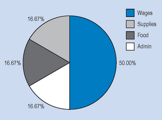
It can be seen in Figure 13.2 that by presenting the data for the experimental and control groups on the same graph, the reader gains a visual impression of the possible effectiveness of the analgesic treatment in contrast to that of the control intervention or treatment. Nominal data can also be meaningfully presented as a pie chart, where the percentage of each category is converted into a proportional part of a circle or ‘pie’. For example, in a given hospital we have the hypothetical spending patterns shown in Table 13.3.
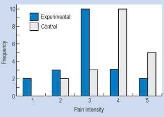
Table 13.3 Hypothetical spending patterns
| Item | Cost ($) | Percentage of total |
|---|---|---|
| Wages and salaries | 1 500 000 | 50.00 |
| Medical supplies | 500 000 | 16.67 |
| Food and provisions | 500 000 | 16.67 |
| Administrative costs | 500 000 | 16.67 |
| Total | $3 000 000 | 100.00 |
Figure 13.3 represents a pie chart of the information. In constructing Figure 13.3, we converted the numbers into percentages and then into degrees (out of a total of 100% = 360°), that is, each 1% of the total is represented by 3.6° in the circle.
Organization and presentation of interval or ratio data
Previously we have noted that interval and ratio scales of measurement produce real numbers that can be processed according to the standard rules of arithmetic. Interval and ratio measurements typically produce continuous data (such as weight, length, time, IQ), implying that increasingly accurate values of the variable are possible to obtain, depending on the precision of the measurement process. For example, the weight of a neonate could be measured as 4, 4.2, 4.18 or 4.183 kg.
Grouped frequency distributions
When the continuous data are made up of a large number of varied measurements, it is useful to present the data as grouped frequency distributions. When drawing up a grouped frequency distribution, the following conventions should be taken into account:
Example
On admission to hospital, patients are routinely weighed. You are asked to summarize the weights of 50 male patients who were admitted in your ward over a period of time. The weights (raw data) are as follows (to nearest kg):
75, 67, 76, 71, 73, 86, 72, 77, 80, 75, 80, 96, 93, 75, 73, 83, 81, 82, 73, 92, 81, 87, 76, 84, 78, 79, 99, 100, 88, 77, 71, 76, 75, 83, 66, 79, 95, 85, 77, 87, 90, 73, 72, 68, 84, 69, 78, 77, 84, 94
The steps in constructing a grouped frequency distribution are:
Table 13.5 Grouped frequency distribution of patients’ weight in a given ward
| Class interval | f |
|---|---|
| 66–70 | 4 |
| 71–75 | 12 |
| 76–80 | 13 |
| 81–85 | 9 |
| 86–90 | 5 |
| 91–95 | 4 |
| 96–100 | 3 |
| n = 50 |
It is easier to understand the data by inspecting Table 13.5 than by looking at the raw data. However, some precision in the data has been lost as somewhat different scores have been assigned into the same class intervals.
Graphing frequency distributions
The two common types of graphs used to graph frequency distribution of quantitative data are histograms and frequency polygons.
Histograms
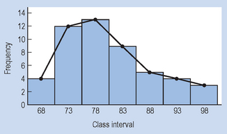
A histogram resembles a bar graph but the bars are drawn to touch each other. The fact that the bars touch each other reflects the underlying continuity of the data. The height of the bars along the y-axis represents the frequency of each score or class interval plotted along the x-axis. With grouped data, the midpoint of each class interval becomes the midpoint of each bar, and the width of the bar corresponds to the real limits of each class interval.
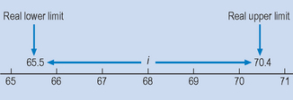
For example, consider the lowest class interval 66–70 on Table 13.5. Because the data are continuous, the real upper and lower limits of the class interval are 65.5 and 70.4 (Fig. 13.4). Although all the weights are given as whole numbers of kilograms, these will in most cases be the result of rounding off by the nursing staff to the nearest whole number. Thus, someone who actually weighed 70.2 kg would have been recorded as weighing 70 kg and would fall into the 66–70 class. As Figure 13.4 shows, i = 5, and the midpoint of the class interval is 68.
Frequency polygons
Any data which can be represented by a histogram can also be graphed as a frequency polygon. For this type of graph, a point is plotted over the midpoint of each class interval, at a height representing the frequency of the scores. Figure 13.5 represents a histogram and a frequency polygon for the data in Table 13.5.
Frequency polygons allow the reader to interpolate, that is, to estimate the frequency of values in between those actually measured or graphed. Of course, interpolation cannot be done for discrete data (for example, Fig. 13.1), as values between categories have no meaning. When a frequency polygon is plotted, it can take on a variety of shapes. The shapes which are of particular importance for frequency polygons are shown in Figure 13.6.
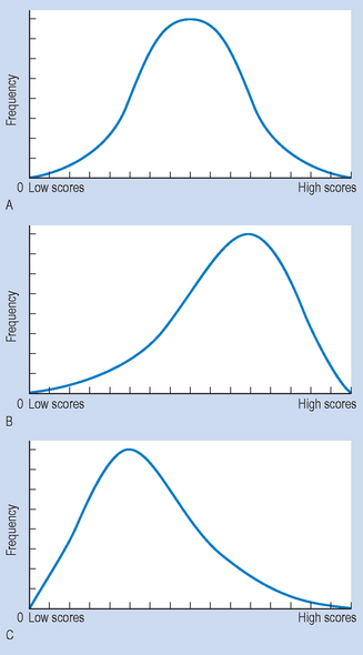
Figure 13.6 Shapes of frequency polygons: (A) normal distribution; (B) negative skewing; (C) positive skewing.
Figure 13.6A represents a bell-shaped, normal distribution. It is symmetrical, in the sense that one-half is the mirror image of the other. The curve indicates that most of the scores fell in the middle, with relatively few scores towards either ‘tail’. Figure 13.6B represents a negatively skewed distribution, with most of the scores being high and spreading out toward the lower end of the distribution. Figure 13.6C represents a positively skewed distribution, with most of the scores being low, but with some scores spreading out towards the upper end of the distribution.
An easy way to remember the direction of the skew is to consider the region where the ‘tail’ or portion of the graph with lower frequencies falls. For example, if the tail is located at the low score end of the x-axis, the graph is negatively skewed. The significance of the skew or a symmetrical, normal distribution will be discussed in subsequent sections.
Simple descriptive statistics
Once the data have been summarized in frequency distribution, it is often useful to make comparisons concerning the relative frequencies of scores falling into specific categories. The following statistics are useful for understanding comparative trends in the data, and can be used for measurements on any scale: nominal, ordinal, interval or ratio. A statistic is a number resulting from a computation based upon the raw data. The calculation of statistics is essential for ‘crunching’ the raw data into single numbers that represent the characteristics of the full data set.
Ratios
Ratios are statistics which express the relative frequency of one set of frequencies, A, in relation to another, B. The formula for ratios is:

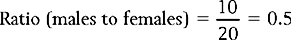
Therefore, the ratio of males to females for the data presented in Table 13.1 is:
or
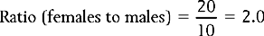
Ratios are useful in the health sciences when we are interested in the distribution of illnesses or symptoms or the categories of subjects requiring or benefiting from treatment. The ratio calculated above tells us about the relative frequency of gall bladder surgery for males and females.
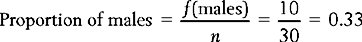
Proportions
Proportions are statistics which are calculated by putting the frequency of one category over that of the total numbers in the sample or the population:
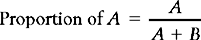
Therefore, the proportion of males in the sample represented in Table 13.1 is:
Percentages
Proportions can be transformed into percentages, by multiplying by 100. Of course, this is how we obtained the values of the y-axis for Figure 13.2. To illustrate, patients scoring 5 (excruciating pain) in the control group:

The values of the pie chart (Fig. 13.3) also involved such calculations.
Rates
When summarizing the results of epidemiological investigations it is often useful to use this statistic to represent the level at which a disorder is present in a given population. The two rates which are commonly used in the health sciences are:
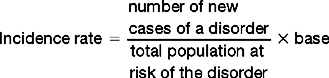
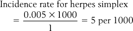
Let us illustrate the above equation by applying it to hypothetical data. Let us consider the condition herpes, a nasty little condition associated with the virus herpes simplex that attacks various parts (lips, etc.) of the body. Assume that an epidemiologist is interested in the spread of the condition in a given community.
Here, substituting into the equation:

The statistic 0.005 is not seen as the best way to represent a rate.
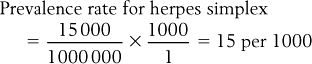
Often, epidemiologists select a base to make the statistic more understandable. The base represents a number for transforming the rate. The base selected depends on the magnitude of the rate; conventionally a multiple of 10, such as 1000, 10 000 or 100 000 is selected. In this instance we select 1000 as the base. Therefore, substituting into the equation, we obtain:
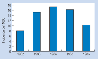
The above statistics can be graphed. For example, we may wish to represent pictorially the incidence of herpes simplex in the community over a period of 5 years. The (fictitious) evidence is shown in Table 13.6.
Table 13.6 Incidence of herpes
| Year | Incidence of herpes (per 1000) |
|---|---|
| 1982 | 8 |
| 1983 | 15 |
| 1984 | 17 |
| 1985 | 16 |
| 1986 | 10 |
The graph of the time-series for the incidence over time (Fig. 13.7) gives us a visual impression of the changing incidence rate of the problem in question.
Summary
We outlined several techniques for organizing, tabulating and graphically presenting both discontinuous (nominal, ordinal) and continuous (interval, ratio) data. It was shown that raw data can be organized and tabulated as a frequency distribution, by counting the number of cases falling into specific categories or class intervals. Data composed of a large number of highly varied measurements were shown to be best presented by grouping the scores into class intervals.
Several techniques of graphing data were discussed: bar graphs and pie charts for discontinuous data, and histograms and frequency polygons for continuous data. The possible shapes of frequency polygons were also examined. It was shown that data grouped in frequency distributions could also be represented as ratios, proportions, percentages or rates. These statistics were obtained by computations based upon the raw data, and were shown to be useful for representing the characteristics of all the raw data. In the next chapter, we will examine further techniques of ‘crunching’ or condensing data by using appropriate descriptive statistics.
Self-assessment
Explain the meaning of the following terms:
True or false
Multiple choice
| Pain ratings | Treatment A | Treatment B |
|---|---|---|
| 31–40 | 1 | 1 |
| 41–50 | 2 | 2 |
| 51–60 | 3 | − |
| 61–70 | 10 | 3 |
| 71–80 | 4 | 4 |
| 81–90 | 3 | 10 |
| 91–100 | 2 | 5 |
| Heart disease | 35% |
| Cancer | 25% |
| Cerebrovascular disease | 15% |
| Trauma | 10% |
| Respiratory illness | 5% |
| Infections | 5% |
| Other causes | 5% |
| Class interval | Time in seconds Normals | Brain-damaged |
|---|---|---|
| 12–14 | 1 | 0 |
| 15–17 | 2 | 0 |
| 18–20 | 5 | 1 |
| 21–23 | 10 | 2 |
| 24–27 | 4 | 4 |
| 28–30 | 3 | 10 |
| 31–33 | 1 | 3 |