Chapter Fifteen Standard scores and the normal curve
Introduction
In this chapter we will discuss standard distributions. Standard scores represent the position of a score or measurement in relation to an overall set of scores. Standard distributions are also useful for comparing scores from different sets of measurements. Standard scores are used in both clinical practice and research in the health sciences. In clinical practice the score of a patient is often compared with a known distribution to interpret the score. Measures such as blood pressure or cholesterol measurements are compared with a distribution to interpret the patient’s result.
Standard scores (z scores)
Consider this example: infant A walked unaided at the age of 40 weeks, while infant B is 65 weeks old but still cannot walk. What sense can we make of these measurements? Could infant B need further clinical investigation in case he has some neurological abnormality? The fact that infant B is unable to walk at the age of 65 weeks is not very informative in the absence of additional information about how this compares with norms for other children. However, say that it is known that the distribution of walking ages is such that μ = 50 weeks and σ = 5. Assuming that the frequency distribution is normal, the frequency polygon representing the population would look something like that shown in Figure 15.1.
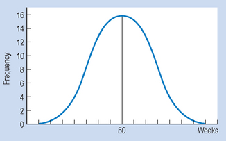
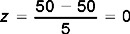
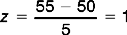
In this instance, infant B’s score is clearly above the mean. In fact, by inspection, we can see the infant’s score at this point of time was three standard deviations above (+ 3) the mean (65 = 50 + (3 × 5)). In contrast, infant A began walking earlier than the mean, his score of 40 being two standard deviations below (− 2) the mean. In general, any ‘raw’ score in a frequency distribution can be described in terms of its distance from the mean. The process of transforming a score into a measurement based on its distance from the mean in standard deviations is called standardizing the score. Such ‘transformed’ scores are called z scores or standard scores.
A z score represents how many standard deviations a given raw score is above or below the mean. The equation for transforming specific raw scores into z scores is given as:
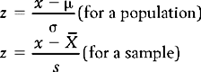
For the above equation, x is the raw score,  or μ is the mean of the distribution from which the score was drawn and s or σ is the standard deviation of the distribution. That is, when we know the mean and standard deviation of a distribution, we can transform any raw score into a z score. Conversely, when the z score is known, we can use the above equations to calculate the corresponding raw scores.
In the above example, the z scores corresponding to the infants’ raw scores are:
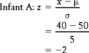

These calculations support our previous observations that A’s score was two standard deviations below the mean and B’s score was three standard deviations above the mean. In other words, A walked very early and B was a very late starter. The particular value of standardizing scores for understanding clinical or research evidence will be discussed in the context of the concepts of normal and standard normal distributions.
Normal distributions
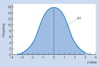
Many variables measured in the biological, behavioural and clinical sciences are approximately ‘normally’ distributed. What is meant by a normal distribution is illustrated by the normal curve (see Fig. 15.2), which is a frequency polygon representing the theoretical distribution of population scores. We assume here that the variable x has been measured on an interval or ratio scale and that it is a continuous variable such as weight, height or blood pressure.
The normal curve has the following characteristics:
We need not worry about the actual formula. Rather, the point is that, given that the functional relationship between f and x is known, integral calculus can be used to calculate areas under the curve for any value of x. All normal curves have the same general mathematical form; whether we are graphing IQ or weight, the same bell-shape will appear. The only differences between the curves are the mean value and the amount of variation. This is why the mean and the standard deviation provide us with important information about any particular normal distribution. Note that it is unlikely that any real data are exactly normally distributed. Rather, the normal distribution is a mathematical model that is useful for representing real distributions.
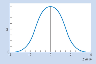
The standard normal curve
If we transform the raw scores of a variable into z scores and then plot the frequency polygon for the distribution, we will have a standard curve. If the original distribution was normal, then the frequency polygon will be a standard normal curve. Standard normal curves are identical regardless of the nature of the original variables.
By transforming raw scores into z scores we are adjusting for differences in means and standard deviations, which are the only things which distinguish between non-standardized normal curves.
The standard normal curve has the following additional properties:
In the next subsection, we will examine the use of the table of areas under the standard normal curve to understand the meaning of measurements in relation to distributions.
Calculations of areas under the normal curve
We have already examined the concept of percentile or centile ranks. The normal curve is useful for evaluating the percentile rank of scores in normal distributions. Appendix A gives the proportion of areas under the standard normal curve which lies:
Since normal distributions are symmetrical, the same proportions are also true for the area between the mean and any negative z score. Only the positive values are given in Appendix A.
Let us see how we can use this information to estimate the percentile ranks of the two infants’ walking ages. We have shown previously in our hypothetical example that for infant A, z = − 2. Let us now turn to Appendix A. In going down the column of z scores, we find that the area corresponding to z = 2.00 is 0.4772 (between) and 0.0228 (beyond).
We know that the area A1 under the curve in Figure 15.3 must be:
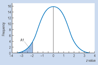
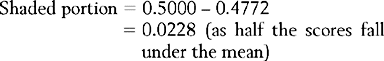
This proportion can be expressed as a percentage, so that 2.28% of the cases in the distribution fall below z = − 2. We have defined percentile rank for a score as the percentage of cases in a distribution falling up to and including a specific score. Therefore, the percentile rank for infant A’s walking is 2.28%. Of all children, only 2.28% learn to walk as early as or earlier than infant A. Clearly, he is doing well.
What then is the percentile rank for infant B’s performance? As you remember, z = + 3. Looking up the area corresponding to z = 3.00 in Appendix A we find the area (A1 in Fig. 15.4) is equal to 0.4987. Therefore, the proportion of scores falling up to and including z = + 3 is 0.5 + 0.4987 = 0.9987.
Expressing this finding as a percentage, we find that 99.87% of children learn to walk by the age of 65 weeks. As we said earlier, infant B is still not walking. Perhaps further clinical tests are indicated, although we should keep in mind that an unusual or extreme score is not necessarily indicative of pathological states.
Critical values
We can work the other way by determining the raw scores corresponding to areas under the normal curve in Appendix A. For example, say that the slowest 5% of infants are offered some special exercises in learning to walk. What would be the age at which the exercises should be offered, should the child not be walking? The key here is to determine the score that corresponds to the 95th percentile of the distribution. This can be represented as shown in Figure 15.5.
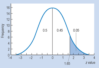
From Figure 15.5 we can see that we need to discover the z score that corresponds to an area of 0.45 above the mean. By consulting the normal distribution table (see Appendix A), it can be seen that the corresponding z score is z = 1.65. This is a critical value for the statistic in defining an area.
Given the z score, we can calculate the corresponding raw score from the formula:
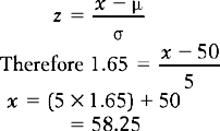
That is, if the slowest 5% are thought to be in need of help, then children somewhat over 58 weeks old and still not walking would be recommended for the remedial exercises. Of course, we can use the tables for reading off the z scores corresponding to any specified area or percentage.
Standard normal curves for the comparison of distributions
One of the uses of standard distributions is that we can compare scores from entirely different distributions. For example, if a student scored 63 on test A, and 52 on test B, on which test did the student do better? If we define ‘better’ as solely in terms of raw scores, then clearly the student did better on test A. However, test A might have been easier than test B, so that if the overall performances of all students on the tests are taken into account, the student’s relative performance might be better on test B.
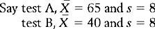
Therefore, using the formula for calculating z scores, and looking up the corresponding areas in Appendix A (do this yourself) we obtain the results shown in Table 15.1. Thus, the student performed better on test B, by scoring higher than 93% of other students sitting for the test.
Table 15.1 Scores for example in text
| Raw scores | z scores | Percentile ranks |
|---|---|---|
| x = 63 | −0.25 | 40.1 |
| x = 52 | +1.50 | 93.3 |
This example illustrates that in some circumstances the meaning of specific scores has to be interpreted against ‘standards’.
Another use of standard distributions is in interpreting the meaning of the results of investigations in the health sciences. Let us examine the following hypothetical example. An investigator measured levels of blood cholesterol in a sample of 300 adults who are meat eaters, and 100 adults who are vegetarians. The results of the investigation are summarized in Table 15.2.
| Mean blood cholesterol (mg/cc) | Standard deviation | |
|---|---|---|
| Meat eaters | 0.6 | 0.15 |
| Vegetarians | 0.4 | 0.1 |
Now, imagine that you are a clinician working with patients with cardiac disorders and you are interested in the following questions:
The percentage of cases of vegetarians with blood cholesterol greater than 0.6 (the mean for the meat eaters) is represented by area A1 in Figure 15.6.
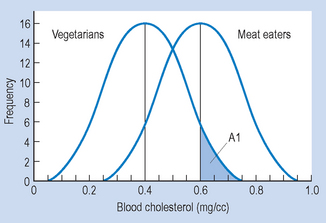
Figure 15.6 Area A1 corresponds to the percentage of vegetarians with blood cholesterol higher than 0.6 mg/cc.
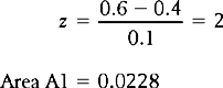
Therefore, approximately 2.3% of vegetarians had blood cholesterol levels higher than the average for meat eaters.
Figure 15.7 demonstrates the area (A2) corresponding to the percentage of meat eaters with lower blood cholesterol than the average vegetarian.
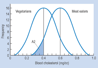
Figure 15.7 Area A2 corresponds to the percentage of meat eaters with lower blood cholesterol than the mean for vegetarians.
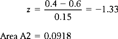
Therefore, approximately 9.2% of meat eaters had lower blood cholesterol levels than the average vegetarian.
Summary
We found that if the mean and standard deviation for a given distribution have been calculated, then we can transform any raw score into a standard (or z) score. The z score represents how many standard deviations a specific score is above or below the mean. We described how to calculate this transformed score for a population or a sample. Also, we outlined the essential characteristics of the normal and the standard normal curves.
It was pointed out that if the original frequency distribution was approximately normal, then the table of normal curves (Appendix A) could be used to calculate percentile ranks of raw scores, or the percentage of scores falling between specified scores. Also, z scores were shown to be useful in comparing scores arising from two or more different normal distributions. The above information is applicable to clinical practice, for example in interpreting the significance of an individual’s assessment in relation to known population norms.
Self-assessment
Explain the meaning of the following terms:
True or false
and s, the greater the value of the z scores in corresponding standard distributions.