Using Statistics to Describe Variables
Data analysis begins with description; this applies to any study in which the data are numerical, including some qualitative studies. Descriptive statistics allow the researcher to organize the data in ways that give meaning and insight and to examine a phenomenon from a variety of angles. The researcher can use descriptive analyses to generate theories and develop hypotheses. For some types of descriptive studies, descriptive statistics will be the only approach to analysis of the data. The selection of statistical tests is dependent upon the level of measurement (nominal, ordinal, interval, or ratio). This chapter describes a number of uses for descriptive analysis: to summarize data, to explore deviations in the data, and to describe patterns across time.
USING STATISTICS TO SUMMARIZE DATA
A frequency distribution is usually the first strategy a researcher uses to organize data for examination. In addition, frequency distributions will allow you to check for errors in coding and computer programming. There are two types of frequency distributions: ungrouped and grouped. In addition to providing a means to display the data, these distributions may influence decisions concerning further data analysis.
Ungrouped Frequency Distribution
Most studies have some categorical data that are presented in the form of an ungrouped frequency distribution. To develop an ungrouped frequency distribution, list all categories of that variable on which you have data and tally each datum on the listing. For example, suppose you wanted to list the categories of pets in the homes of elderly clients; the groupings might include dogs, cats, birds, and rabbits. A tally of the ungrouped frequencies would have the following appearance:
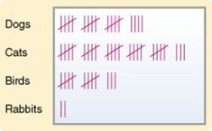
You would then count the tally marks and develop a table to display the results. This approach is generally used on discrete (categorical) rather than continuous data. Data commonly organized in this manner include gender, ethnicity, marital status, and diagnostic category. Continuous data, such as test grades or scores on a data collection instrument, could be organized in this manner as well; however, if the number of possible scores is large, it is difficult to extract meaning from examining the distribution.
Grouped Frequency Distribution
In general, it is best to determine some method of grouping when you are examining continuous variables. Age, for example, is a continuous variable. Many measures taken during data collection are continuous, including income, temperature, vital lung capacity, weight, scale scores, and time. Grouping will require you to make a number of decisions that will be important to the meaning derived from the data.
Any method you use to group data will result in a loss of some information and will change the level of measurement, which will impact how you can use the data. For example, if you are developing a group based on age, a breakdown of under 65/over 65 will provide considerably less information than will groupings that have been separated into 10-year spans. The grouping should be devised to provide the greatest possible meaning in terms of the purpose of the study. If the data are to be compared with data in other studies, groupings should be similar to those of other studies in that field of research.
The first step in developing a grouped frequency distribution is to establish a method of classifying the data. The classes that are developed must be exhaustive: Each datum must fit into one of the identified classes. The classes must be mutually exclusive: each datum can fit into only one of the established classes. A common mistake is to list ranges that contain overlaps. For example, you might have age categories of 40 to 50, 50 to 60, etc. Thus, the age 50 would overlap, allowing the age of 50 to be coded as 40 to 50, 50 to 60, or both. The range of each category must be equivalent. In the case of age, for example, if 10 years is the range, each category must include 10 years of ages. The first and last categories may be open-ended and worded to include all scores above or below a specified point. The precision with which the data will be reported is an important consideration. For example, you may decide to list your data only in whole numbers, or decimals may be used. If you use decimals, you will need to decide at how many decimal places rounding off will be performed.
Percentage Distribution
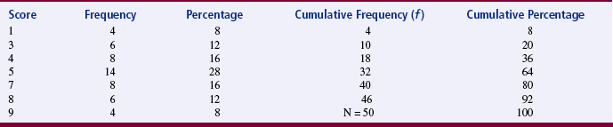
Percentage distribution indicates the percentage of the sample with scores falling in a specific group, as well as the number of scores in that group. Percentage distributions are particularly useful in comparing the present data with findings from other studies that have varying sample sizes. A cumulative distribution is a type of percentage distribution in which the percentages and frequencies of scores are summed as one moves from the top of the table to the bottom (or the reverse). Thus, the bottom category would have a cumulative frequency equivalent to the sample size and a cumulative percentage of 100 (Table 19-1). Frequency distributions can be displayed as tables, diagrams, or graphs. Four types of illustrations are commonly used: charts, bar graphs, histograms, and frequency polygons. Examples of diagrams and graphs are presented in Chapter 25. Frequency analysis and graphic presentation of the results can be performed on the computer.
Measures of Central Tendency
A measure of central tendency is frequently referred to as an average. Average is a lay term not commonly used in statistics because of its vagueness. Measures of central tendency are the most concise representation of the location of the data. The three measures of central tendency commonly used in statistical analyses are the mode, median (MD), and mean.
Mode
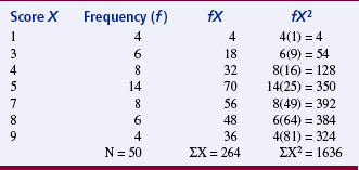
The mode is the numerical value or score that occurs with the greatest frequency; it does not necessarily indicate the center of the data set. To determine the mode, examine an ungrouped frequency distribution of the data. In Table 19-1, the mode is the score of 5, which occurred 14 times in the data set. The mode can be used to describe the most common subject or to identify the value that occurs most frequently on a scale item. The mode is the only appropriate measure of central tendency for nominal data and is used to calculate some nonparametric statistics. Otherwise, it is seldom used in statistical analysis. A data set can have more than one mode. If two modes exist, the data set is referred to as bimodal; a data set that contains more than two modes would be multimodal.
Median
The median (MD) is the score at the exact center of the ungrouped frequency distribution. It is the 50th percentile. You can obtain the MD by rank-ordering the scores. If the number of scores is an uneven number, exactly 50% of the scores are above the MD and 50% are below it. If the number of scores is an even number, the MD is the average of the two middle scores. Thus, the MD may not be an actual score in the data set. It is not considered to be as precise an estimator of the population average when sampling from normal populations (and distributions) as the sample average is. In most cases of skewed distributions, it is actually the preferred choice because in these cases it is a more precise measure of central tendency. An example of a skewed distribution would be “days of hospitalization.” The largest incidence would be only a few days with fewer instances occurring as the number of days of hospitalization increase. The MD is not affected by extreme scores in the data (outliers), as is the mean. An example of an outlier could be, in “days of hospitalization,” data showing higher numbers of days as follows: 42, 44, 56, 64, 244. The value of 244 is an outlier because it is extremely high in comparison with the other values. The MD is the most appropriate measure of central tendency for ordinal data but is also used for interval and ratio data. It is frequently used in nonparametric analysis.
Mean
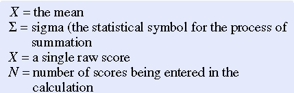
The most commonly used measure of central tendency is the mean. The mean is the sum of the scores divided by the number of scores being summed. Thus, like the MD, the mean may not be a member of the data set. The formula for calculating the mean is as follows:

where
The mean was calculated for the data provided in Table 19-1 as follows:
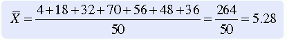
The mean is an appropriate measure of central tendency for approximately normally distributed populations with variables measured at the interval or ratio level. This formula is presented repeatedly within more complex formulas of statistical analysis. The mean is sensitive to extreme scores such as outliers.
USING STATISTICS TO EXPLORE DEVIATIONS IN THE DATA
Although the use of summary statistics has been the traditional approach to describing data or describing the characteristics of the sample before inferential statistical analysis, its ability to clarify the nature of data is limited. For example, using measures of central tendency, particularly the mean, to describe the nature of the data obscures the impact of extreme values or deviations in the data. Thus, significant features in the data may be concealed or misrepresented. Often, anomalous, unexpected, problematic data and discrepant patterns are evident but are not regarded as meaningful. Measures of dispersion, such as the modal percentage, range, difference scores, sum of squares (SS), variance, and standard deviation (SD), provide important insight into the nature of the data.
Measures of Dispersion
Measures of dispersion, or variability, are measures of individual differences of the members of the population and sample. They indicate how scores in a sample are dispersed around the mean. These measures provide information about the data that is not available from measures of central tendency. They indicate how different the scores are—the extent to which individual scores deviate from one another. If the individual scores are similar, measures of variability are small and the sample is relatively homogeneous in terms of those scores. Heterogeneity (wide variation in scores) is important in some statistical procedures, such as correlation. Heterogeneity is determined by measures of variability. The measures most commonly used are modal percentage, range, difference scores, SS, variance, and SD.
Modal Percentage
The modal percentage is the only measure of variability appropriate for use with nominal data. It indicates the relationship of the number of data scores represented by the mode to the total number of data scores. To determine the modal percentage, divide the frequency of the modal scores by the total number of scores. For example, in Table 19-2, the mode is 5 because 14 of the subjects scored 5, and the sample size is 50; thus, 14/50 = 0.28. Next, multiply the result of that operation by 100 to convert it to a percentage. In the example, the modal percentage is 28%, which means that 28% of the sample is represented by the mode. The complete calculation would be 14/50(100) = 28%. This strategy allows the present data to be compared with other data sets. Calculate the modal percentage of the data in Table 19-1.
Range
The simplest measure of dispersion is the range. In published studies, range is presented in two ways: (1) the range is the lowest and highest scores, or (2) the range is calculated by subtracting the lowest score from the highest score. The range for the scores in Table 19-2 is 1 and 9 or can be calculated as follows: 9 - 1 = 8 to provide the value of 8 as the range. In this form, the range is a difference score that uses only the two extreme scores for the comparison. Most studies list the low value and the high value as the range. The range is a crude measure, but it is sensitive to outliers. Outliers are subjects with extreme scores that are widely separated from scores of the rest of the subjects. The range is generally reported but is not used in further analyses. The range is not a useful measure for comparing the present data with data from other studies.
Difference Scores
Difference scores are obtained by subtracting the mean from each score. Sometimes a difference score is referred to as a deviation score because it indicates the extent to which a score deviates from the mean. The difference score is positive when the score is above the mean, and it is negative when the score is below the mean. Difference scores are the basis for many statistical analyses and can be found within many statistical equations. The sum of all difference scores is zero, which makes the sum a useless measure. The formula for difference scores is

Sum of Squares
A common strategy used to manipulate difference scores in a meaningful way is to square them. These squared scores are then summed. The mathematical symbol for the operation of summing is S. When negative scores are squared, they become positive, and therefore the sum will no longer equal zero. This mathematical maneuver is referred to as the sum of squares (SS). The SS is also the sum of squared deviations. The equation for SS is
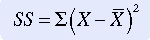
The larger the value of SS, the greater the variance. (Variance is a measure of dispersion that is the mean or average of the sum of squares.) Because the value of SS depends on the measurement scale used to obtain the original scores, comparison of SS with that obtained in other studies is limited to studies using similar data. SS is a valuable measure of variance and is used in many complex statistical equations. The SS is important because when deviations from the mean are squared, this sum is smaller than the sum of squared deviations from any other value in a sample distribution. This relationship is referred to as the least-squares principle and is important in mathematical manipulations.
Variance
Variance is another measure commonly used in statistical analysis. The equation for variance (V) is
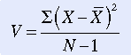
As you can see, variance is the mean or average of SS. Again, because the result depends on the measurement scale used, it has no absolute value and can be compared only with data obtained by using similar measures. However, in general, the larger the variance, the larger the dispersion of scores.
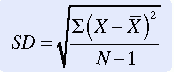
Standard Deviation
Standard deviation (SD) is a measure of dispersion that is the square root of the variance. This step is important mathematically because squaring mathematical terms changes them in some important ways. Obtaining the square root reverses this change. The equation for obtaining SD is
Although this equation clarifies the relationships among difference scores, SS, and variance, using it requires that all these measures in turn be calculated. If SD is being calculated directly by hand (or with the use of a calculator), the following computational equation is easier to use. Data from Table 19-2 were used to calculate the SD:
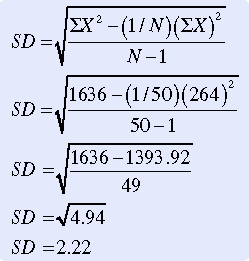
Just as the mean is the “average” score, the SD is the “average” difference (deviation) score. SD measures the average deviation of a score from the mean in that particular sample. It indicates the degree of error that would be made if the mean alone were used to interpret the data. SD is an important measure, both for understanding dispersion within a distribution and for interpreting the relationship of a particular score to the distribution. Researchers usually use computers to calculate descriptive statistics (mean, MD, mode, and SD).
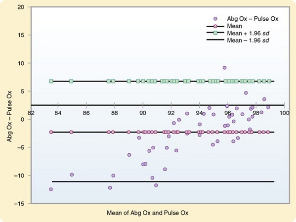
Bland and Altman Plots
Bland and Altman plots are used to examine the extent of agreement between two measurement techniques. Generally, they are used to compare a new technique with an established one and have been used primarily with physiological measures. For example, suppose you wanted to compare pulse oximeter values with arterial blood gas values (Figure 19-1). You can plot the difference between the measures of the two methods against the average of the two methods. Thus, for each pair you would calculate the difference between the two values, as well as the average of the two values. You can then plot these values on a graph, displaying a scatter diagram of the differences plotted against the averages. Three horizontal lines are displayed on the graph to show the mean difference, the mean difference plus 1.96 times the SD of the differences, and the mean difference minus 1.96 times the SD of the differences. The value of 1.96 corresponds to 95% of the areas beneath the curve. The plot reveals the relationship between the differences and the averages, allows you to search for any systematic bias, and identifies outliers. In some cases, two measures may be closely related near the mean but become more divergent as they move away from the mean. This pattern has been the case with measures of pulse oximetry and arterial blood gases (see Figure 19-1). Traditional methods of comparing measures such as correlation procedures will not identify such problems. Interpretation of the results is based on whether the differences are clinically important (Bland & Altman, 1986).
You can also use this analysis technique to examine the repeatability of a single method of measurement. By using the graph, you can examine whether the variability or precision of a method is related to the size of the characteristic being measured. Because the same method is being measured repeatedly, the mean difference should be zero. Use the following formula to calculate a coefficient of repeatability (CR). MedCalc can perform this computation of CR, as follows:
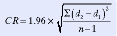
where d is the value of a measure.
USING STATISTICS TO DESCRIBE PATTERNS ACROSS TIME
One of the critical needs in nursing research is to examine patterns across time. Most nursing studies have examined events at a discrete point in time, and yet the practice of nursing requires an understanding of events as they unfold. This knowledge is essential for developing interventions that can have a positive effect on the health and illness trajectories of the patients in our care. Data analysis procedures that hold promise of providing this critical information include plots displaying variations in variables across time and survival analysis.
Analysis of Case Study Data
In case studies, large volumes of both qualitative and quantitative data are often gathered over a certain period. A clearly identified focus for the analysis is critical. Yin (1994) identified purposes for a case study:
1. To explore situations, such as those in which an intervention is being evaluated, that have no clear set of outcomes
2. To describe the context within which an event or intervention occurred
3. To describe an event or intervention
4. To explain complex causal links
Data analysis strategies vary depending on the research questions posed. Because multiple sources of data (some qualitative and some quantitative) are usually available for each variable, triangulation strategies are commonly applied in case study analyses. The qualitative data are analyzed by methods described in Chapter 23. A number of analysis approaches are available for examining quantitative data. Some analytical techniques include pattern matching, explanation building, and time-series analysis (Yin, 1994). Pattern matching compares the pattern found in the case study with one that is predicted to occur. Explanation building is an iterative process that builds an explanation of the case. Time-series analysis may involve visual displays of variations in variables across time, which are presented in the form of plots. If more than one subject was included in the study, plots may be used to compare variables across subjects. Any judgments or conclusions that you make during the analyses must be considered carefully. You should clearly link information from the case to each conclusion.
Survival Analysis
Survival analysis is a set of techniques designed to analyze repeated measures from a given time (e.g., beginning of the study, onset of a disease, beginning of a treatment, initiation of a stimulus) until a certain attribute (e.g., death, treatment failure, recurrence of a phenomenon, return to work) occurs. This form of analysis allows researchers to identify the determinants of various lengths of survival. They can also analyze the risk (hazard or probability) of an event occurring at a given point in time for an individual.
A common feature in survival analysis data is the presence of censored observations. These data come from subjects who have not experienced the outcome attribute being measured. They did not die, the treatment continued to work, the phenomenon did not recur, or they were withdrawn from the study for some reason. Because of censored observations and the frequency of skewed data in studies examining such outcomes, common statistical tests may not be appropriate.
The results of survival analysis are often plotted on graphs. For example, you might plot the period between the initiation of cigarette smoking and the occurrence of smoking-related diseases such as cancer.
Survival analysis has been used most frequently in medical research. When a cancer patient asks how long will I live, the information that the physician provides was probably obtained using survival analysis. The procedure has been used less commonly in nursing research. However, its use is increasing because of further development of statistical procedures and their availability in statistical packages for the PC that include survival analyses.
This procedure allows researchers to study many previously unexamined facets of the nursing practice. Possibilities include the effectiveness of various pain relief measures, the consequences of altering the length of breast-feeding, maintenance of weight loss, abstinence from smoking, recurrence of decubitus ulcers, the likelihood of urinary tract infection after catheterization, and the effects of rehospitalization for the same diagnosis within the 60-day period in which Medicare will not provide reimbursement. The researcher could examine variables that are effective in explaining recurrence within various time intervals or the characteristics of various groups who have received different treatments.
Time-Series Analysis
Time-series analysis is a technique designed to analyze changes in a variable across time and thus to uncover a pattern in the data. Multiple measures of the variable collected at equal intervals are required. Interest in these procedures in nursing is growing because of the interest in understanding patterns. For example, the wave-and-field pattern is one of the themes of Martha Rogers’s (1986) theory. Pattern is also an important component of Margaret Newman’s (1999) nursing theory. Crawford (1982) conceptually defined pattern as the configuration of relationships among elements of a phenomenon. Taylor (1990) has expanded this definition to incorporate time into the study of patterns and defines pattern as “repetitive, regular, or continuous occurrences of a particular phenomenon. Patterns may increase, decrease, or maintain a stable state by oscillating up and down in degree of frequency. In this way, the structure of a pattern incorporates both change and stability, concepts which are important to the study of human responses over time” (Taylor, 1990, p. 256).
Although the easiest strategy for analyzing time-series data is to graph the raw data, this approach to analysis misses some important information. Important patterns in the data are often overlooked because of residual effects in the data. (Residual is defined as extra, remaining, surplus, unused). Residual effects in research are effects remaining after primary effects have been identified statistically and removed from the data. The data remaining contains the residual effects and can then be analyzed to identify various residual effects. Various statistical procedures have been developed to analyze residual effects in the data.
In the past, analysis of time-series data has been problematic because computer programs designed for this purpose were not easily accessible. The most common approach to analysis was ordinary least-squares multiple regression. However, this approach has been unsatisfactory for the most part. Better approaches to analyzing this type of data are now available. With easier access to computer programs designed to conduct time-series analysis, information in the nursing literature on these approaches has been increasing.
SUMMARY
• Data analysis begins with descriptive statistics in any study in which the data are numerical, including some qualitative studies.
• Descriptive statistics allow the researcher to organize the data in ways that facilitate meaning and insight.
• Three measures of central tendency are the mode, median, and mean.
• The measures of dispersion most commonly used are modal percentage, range, difference scores, sum of squares, variance, and standard deviation.
• One of the critical needs in nursing research is to examine patterns across time.
• Data analysis procedures that hold promise for providing patterns include time series analysis and survival analysis.
REFERENCES
Bland, J.M., Altman, D.G. Statistical methods for assessing agreement between two methods of clinical measurement. Lancet. 1986;1(8476):307–310.
Crawford, G. The concept of pattern in nursing: Conceptual development and measurement. Advances in Nursing Science. 1982;5(1):1–6.
Newman, M.A. Health as expanding consciousness. Sudbury, MA: Jones & Bartlett, 1999.
Rogers, M. Science of unitary human beings. In: Malinski V.M., ed. Exploration on Martha Rogers’ science of unitary human beings. Norwalk, CT: Appleton-Century-Crofts; 1986:3–8.
Taylor, D. Use of autocorrelation as an analytic strategy for describing pattern and change. Western Journal of Nursing Research. 1990;12(2):254–261.