Statistical Analysis for Experimental-Type Research
Many newcomers to the research process often equate “statistics” with “research” and are intimidated by this phase of research. You should now understand, however, that conducting statistical analysis is simply one of a number of important action processes in experimental-type research. You do not have to be a mathematician or memorize mathematical formulas to engage effectively in this research step. Statistical analysis is based on a logical set of principles that you can easily learn. In addition, you can always consult a statistical book or Web site for formulas, calculations, and assistance. Because there are hundreds of statistical procedures that range from simple to extremely complex, some researchers specialize in statistics and thus provide another source of assistance if you should need it. However, except for complex calculations and statistical modeling, you should easily
be able to understand, calculate, and interpret basic statistical tests.
The primary objective of this chapter is to familiarize you with three levels of statistical analyses and the logic of choosing a statistical approach. An understanding of this action process is important and will enhance your ability to pose appropriate research questions and design experimental-type strategies. Thus, our purpose here is to provide an orientation to some of the basic principles and decision-making processes in this action phase rather than describe a particular statistical test in detail or discuss advanced statistical procedures. We refer you to user-friendly Web sites and the references at the end of the chapter for other resources that discuss the range of available statistical analyses. Also, refer to the interactive statistical pages at http://www.statpages.net and the large list of online statistical Web sites that are listed on Web Pages that Perform Statistical Calculations at http://www.geocities.com/Heartland/Flats/5353/research/statcalc.html.
What is statistical analysis?
Statistical analysis is concerned with the organization and interpretation of data according to well-defined, systematic, and mathematical procedures and rules. The term “data” refers to information obtained through data collection to answer such research questions as, “How much?” “How many?” “How long?” and “How fast?” In statistical analysis, data are represented by numbers. The value of numerical representation lies largely in the clarity of numbers. This property cannot always be exhibited in words.
 Assume you visit your physician, and she indicates that you need a surgical procedure. If the physician says that most patients survive the operation, you will want to know what is meant by “most.” Does it mean 58 out of 100 patients survive the operation, or 80 out of 100?
Numerical data provide a precise language to describe phenomena. As tools, statistical analyses provide a method for systematically analyzing and drawing conclusions to tell a quantitative story. Statistical analyses can be viewed as the stepping-stones used by the experimental-type researcher to cross a stream from one bank (the question) to the other (the answer).
You now can see that there are no surprises in the tradition of experimental-type research. Statistical analysis in this tradition is guided by and dependent on all the previous steps of the research process, including the level of knowledge development, research problem, research question, study design, number of study variables, level of measurement, sampling procedures, and sample size. Each of these steps logically leads to the selection of appropriate statistical actions. We discuss each of these later in the chapter.
First, it is important to understand three categories of analysis in the field of statistics: descriptive, inferential, and associational. Each level of statistical analysis corresponds to the particular level of knowledge about the topic, the specific type of question asked by the researcher, and whether the data are derived from the population as a whole or are a subset or sample. Experimental-type researchers aim to predict the cause of phenomena. Thus, the three levels of statistical analysis are hierarchical and consistent with the level of research questioning discussed in Chapter 7, with description being the most basic level.
Descriptive statistics make up the first level of statistical analysis and are used to reduce large sets of observations into more compact and interpretable forms.1 If study subjects make up the entire research population, descriptive statistics can be primarily used; however, descriptive statistics are also used to summarize the data derived from a sample. Description is the first step of any analytical process and typically involves counting occurrences, proportions, or distributions of phenomena. The investigator must descriptively examine the data before proceeding to the next levels of analysis.
The second level of statistics involves making inferences. Inferential statistics are used to draw conclusions about population parameters based on findings from a sample.2 The statistics in this category are concerned with tests of significance to generalize findings to the population from which the sample is drawn. Inferential statistics are also used to examine group differences within a sample. If the study subjects make up a sample, both descriptive and inferential statistics can be used. There is no need to use inferential statistics when analyzing results from an entire population, because the purpose of inferential statistics is to estimate population characteristics and phenomena from the study of a smaller group, a sample. Inferential statistics, by their nature, account for errors that may occur when drawing conclusions about a large group based on a smaller segment of that group. You can therefore see, when studying a population in which every element is represented in the study, why no sampling error will occur and thus why there is no need to draw inferences.
Associational statistics are the third level of statistical analysis.2 These statistics refer to a set of procedures designed to identify relationships between and among multiple variables and to determine whether knowledge of one set of data allows the investigator to infer or predict the characteristics of another set. The primary purpose of these multivariate types of statistical analyses is to make causal statements and predictions.
Table 19-1 summarizes the primary statistical procedures associated with each level of analysis. Table 19-2 summarizes the relationship among the level of knowledge, type of question, and level of statistical analysis. Let us examine the purpose and logic of each level of statistical analysis in greater detail.
TABLE 19-1
Primary Tools Used at Each Level of Statistical Analysis
| Level | Purpose | Selected Primary Statistical Tools |
| Descriptive statistics | Data reduction | Measures of central tendency Mode Median Mean Measures of variability Range Interquartile range Sum of squares Variance Standard deviation Bivariate descriptive statistics Contingency tables Correlational analysis |
| Inferential statistics | Inference to known population | Parametric statistics Nonparametric statistics |
| Associational statistics | Causality | Multivariate analysis Multiple regression Discriminant analysis Path analysis |
TABLE 19-2
Relationship of Level of Knowledge to Type of Question and Level of Statistical Analysis
| Level of Knowledge | Type of Question | Level of Statistical Analysis |
| Little to nothing is known | Descriptive Exploratory |
Descriptive |
| Descriptive information is known, but little to nothing is known about relationships | Explanatory | Descriptive Inferential |
| Relationships are known, and well-defined theory needs to be tested | Predictive Hypothesis testing |
Descriptive Inferential Associational |
Level 1: descriptive statistics
Consider all the numbers that are generated in a research study such as a survey. Each number provides information about an individual phenomenon but does not provide an understanding of a group of individuals as a whole. Recall our discussion in Chapter 16 of the four levels of measurement (nominal, ordinal, interval, and ratio). Large masses of unorganized numbers, regardless of the level of measurement, are not comprehensible and cannot in themselves answer a research question.
Descriptive statistical analyses provide techniques to reduce large sets of data into smaller sets without sacrificing critical information. The data are more comprehensible if summarized into a more compact and interpretable form. This action process is referred to as data reduction and involves the summary of data and their reduction to singular numerical scores. These smaller numerical sets are used to describe the original observations. A descriptive analysis is the first action a researcher takes to understand the data that have been collected. The techniques or descriptive statistics for reducing data include frequency distribution, measures of central tendency (mode, median, and mean), variances, contingency tables, and correlational analyses. These descriptive statistics involve direct measures of characteristics of the actual group studied.
Frequency Distribution
The first and most basic descriptive statistic is the frequency distribution. This term refers to both the distribution of values for a given variable and the number of times each value occurs. The distribution reflects a simple tally or count of how frequently each value of the variable occurs in the set of measured objects. As discussed in Chapter 18, frequencies are used to clean raw data files and to ensure accuracy in data entry. Frequencies are also used to describe the sample or population, depending on which has participated in the actual study.
Frequency distributions are usually arranged in table format, with the values of a variable arranged from lowest to highest or highest to lowest. Frequencies provide information about two basic aspects of the data collected. They allow the researcher to identify the most frequently occurring class of scores and any pattern in the distribution of scores. In addition to a count, frequencies can produce “relative frequencies,” which are the observed frequencies converted into percentages on the basis of the total number of observations. For example, relative frequencies tell us immediately what percentage of subjects has a score on any given value.
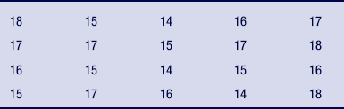
Assume you want to develop a drug prevention program in a high school. To plan adequately, you need to know the ages of the students who will participate. You obtain a list of ages of 20 participants (Table 19-3); the ages are measured at the interval level and are listed in the order in which the students register. However, the list is difficult to derive meaning from or to interpret. For example, the average age of the group, the age distribution among the categories, and the youngest and oldest ages of those who signed up for the program are not immediately apparent on the list. To understand the data, you can develop a simple frequency table (Table 19-4). This table organizes the ages of the sample in ascending order and indicates the number and percentage of students at each age. There is only one variable presented, and its level of measure is interval. This simple rearrangement of the data provides important information that you can immediately understand. From this table, it is readily apparent that ages range from 14 to 18 years and that the most frequently occurring ages are 15 and 17 years.
You can reduce the data further by grouping the ages to reflect an ordinal or nominal level of measurement.
You may want to know how many students fall within the age range of 14 to 16 and 17 to 18 years (ordinal; Table 19-5) or young and old (categorical or nominal).
It is often more efficient to group data on a theoretical basis for variables with a large number of response categories. Frequencies are typically used with categorical data rather than with continuous data, in which the possible number of scores is high, such as test grades or income. It is difficult to derive any immediate understanding from a table with a large distribution of numbers.
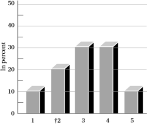
In addition to a table format, frequencies can be visually represented by graphs, such as a pie chart, histogram or bar graph, and polygon (dots connected by lines). Let us use another hypothetical data set to illustrate the value of representing frequencies using some of these formats. Assume you conducted a study with 1000 persons aged 65 years or older in which you obtained scores on a measure of “life satisfaction.” If you examine the raw scores, you will be at a loss to understand patterns or how the group behaves on this measure. One way to begin will be to examine the frequency of scores for each response category of the life satisfaction scale using a histogram. There are five response categories: 5 = very satisfied, 4 = satisfied, 3 = neutral, 2 = unsatisfied, and 1 = very unsatisfied. Figure 19-1 depicts the distribution of the scores by percentage of responses in each category (relative frequency).
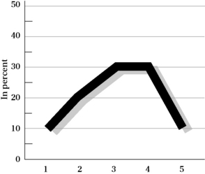
You can also visually represent the same data using a polygon. A dot is plotted for the percentage value, and lines are drawn among the dots to yield a picture of the shape of the distribution, as well as the frequency of responses in each category (Figure 19-2).
Frequencies can be described by the nature of their distribution. There are several shapes of distributions. Distributions can be symmetrical (Figure 19-3, A and B), in which both halves of the distribution are identical. This distribution is referred to as a normal distribution. Distributions can also be nonsymmetrical (Figure 19-3, C and D) and are characterized as positively or negatively skewed. A distribution that has a positive skew has a curve that is high on the left and a tail to the right (Figure 19-3, E). A distribution that has a negative skew has a curve that is high on the right and a tail to the left (Figure 19-3, F). A distribution can be characterized by its shape, or what is called kurtosis, and is either characterized by its flatness (platykurtic; Figure 19-3, G) or peakedness (leptokurtic; Figure 19-3, H). Not shown is a bimodal distribution, which is characterized by two high points. If you plot the age of the 20 students who registered for the drug prevention course (data shown in Table 19-4), you will have a bimodal distribution.
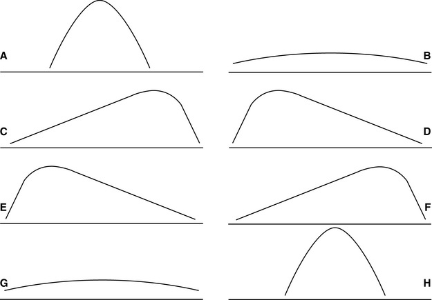
Figure 19-3 Types of frequency distribution: A and B, symmetrical distribution; C and D, nonsymmetrical distribution; E, positively skewed distribution; F, negatively skewed distribution; G, platykurtosis (flatness); H, leptokurtosis (peakedness).
It is good practice to examine the shape of a distribution before proceeding with other statistical approaches. The shape of the distribution will have important implications for determining central tendency and the other types of analysis that can be performed.
Measures of Central Tendency
A frequency distribution reduces a large collection of data into a relatively compact form. Although we can use terms to describe a frequency distribution (e.g., bell shaped, kurtosis, or skewed to the right), we can also summarize the frequency distribution by using specific numerical values. These values are called measures of central tendency and provide important information regarding the most typical or representative scores in a group. The three basic measures of central tendency are the mode, median, and mean.
Mode
In most data distributions, observations tend to cluster heavily around certain values. One logical measure of central tendency is the value that occurs most frequently. This value is referred to as the “modal value” or the mode. For example, consider the data collection of nine observations, such as the following values:
In this distribution of scores, the modal value is 15 because it occurs more than any other score. The mode therefore represents the actual value of the variable that occurs most often. It does not refer to the frequency associated with that value.
Some distributions can be characterized as “bimodal” in that two values occur with the same frequency. Let us use the age distribution of the 20 students who plan to attend the drug abuse prevention class (see Table 19-4). In this distribution, two categories have the same high frequency. This is a bimodal distribution; 14 is the value of one mode, and 17 is the value of the second mode.
In a distribution based on data that have been grouped into intervals, the mode is often considered to be the numerical midpoint of the interval that contains the highest frequency of observations. For example, let us reexamine the frequency distribution of the students' ages (see Table 19-5). The first category of ages, 14 to 16 years, represents the highest frequency. However, because the exact ages of the individuals in that category are not known, we select 15 as our mode because it is the midway point of the numerical values contained within this category.
The advantage of the mode is that it can be easily obtained as a single indicator of a large distribution. Also, the mode can be used for statistical procedures with categorical (nominal) variables (numbers assigned to a category; e.g., 15 male and 25 female).
Median
The second measure of central tendency is the median. The median is the point on a scale above or below which 50% of the cases fall. It lies at the midpoint of the distribution. To determine the median, arrange a set of observations from lowest to highest in value. The middle value is singled out so that 50% of the observations fall above and below that value. Consider the following values:
The median is 27, because half the scores fall below the number 27 and half are above. In an odd number of values, as in the previous case of nine, the median is one of the values in the distribution. When an even number of values occurs in a distribution, the median may or may not be one of the actual values, because there is no middle number; in other words, an even number of values exist on both sides of the median. Consider the following values:
The median lies between the fifth and sixth values. The median is therefore calculated as an average of the scores surrounding it. In this case, the median is 28.5 because it lies halfway between the values of 27 and 30. If the sixth value had been 27, the median would have been 27. Look at Table 19-4 again. Can you determine the median value? Write out the complete array of ages based on the frequency of their occurrence. For example, age 14 occurs three times, so you list 14 three times; the age of 15 occurs five times, so you list 15 five times; and so forth. Count until the 10th and 11th value. What age did you obtain? If you identified 16, you are correct. The age of 16 years occurs in the 10th and 11th value and is therefore the median value of this group of students.
In the case of a frequency distribution based on grouped data, the median can be reported as the interval in which the cumulative frequency equals 50% (or midpoint of that interval).
The major advantage of the median is that it is insensitive to extreme scores in a distribution; that is, if the highest score in the set of numbers shown had been 85 instead of 47, the median would not be affected. Income is an example of how the median is a good indicator of central tendency because it is not affected by extreme values.
Mean
The mean, as a measure of central tendency, is the most fundamental concept in statistical analysis used with continuous (interval and ratio) data. Remember that different from the mode and median, which do not require mathematical calculations (with the exceptions discussed), the mean is derived from manipulating numbers mathematically. Thus, the data must have the properties that will allow them to be subjected to addition, subtraction, multiplication, and division.
Suppose that you were doing a study in which you were interested in comparing how male and female young adults responded to a smoking prevention program. You assign the number “1” to code male gender and “2” to code female gender. It would not make sense to calculate a mean score for gender because 1 and 2 are nominal and used to identify categories rather than magnitude. Similarly, if you coded ages as 1 = ages 18 to 21, 2 = ages 22 to 25, and 3 = ages 26+, you would not be able to subject your ordinal data (1, 2, 3) to the calculation of the mean because these numbers denote order, not mathematical magnitude.
The mean serves two purposes. First, it serves as a data reduction technique in that it provides a summary value for an entire distribution. Second and equally important, the mean serves as a building block for many other statistical techniques. As such, the mean is of the utmost importance. There are many common symbols for the mean (Box 19-1).
 = x bar or mean value of a variable
The formula for calculating the mean is simple:

where ΣXi = sum of all values, M = mean, and N = total number of observations. You may recognize this formula as the one that you learned to calculate averages.
The major advantage of the mean over the mode and median is that in calculating the mean, the numerical value of every observation in the data distribution is considered and used. When the mean is calculated, all values are summed and then divided by the number of values. However, this strength can be a drawback with highly skewed data in which there are outliers or extreme scores, as stated in our discussion of the median. Consider the following example.
Suppose you have just completed teaching a continuing education course in cardiopulmonary resuscitation (CPR). You test your students to determine their competence in CPR knowledge and skill. Of a possible 100, the following scores were obtained:
To calculate the mean, you will add each value and divide the sum by the total number of values (100 + 100 + 100 + 95 + 95 = 490/5 = 98). The mean score of your group is 98. You are satisfied with the scores and with the high level of knowledge and skill. Now let us see what happens in the following distribution of test scores:
The mean is calculated as 100 + 100 + 100 + 90 + 35 = 425/5 = 85. The mean (85) presents quite a different picture, even though only one member of the group scored poorly. If only the mean were reported, you would have no way of knowing that the majority of your class did well and that one individual or outlier score was responsible for the lower mean.
Which Measure(s) to Calculate?
Although investigators often calculate all three measures of central tendency for continuous data, they may not all be useful. Their usefulness depends on the purpose of the analysis and the nature of the distribution of scores. In a normal or bell-shaped curve, the mean, median, and mode are in the same location (Figure 19-4). In this case, it is most efficient to use the mean, because it is the most widely used measure of central tendency and forms the foundation for subsequent statistical calculations.
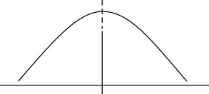
However, in a skewed distribution the three measures of central tendency fall in different places (Figure 19-5). In this case, you will need to examine all three measures and select the one that most reasonably answers your question without providing a misleading picture of the findings.
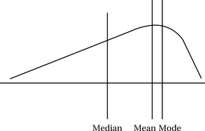
Figure 19-5 Skewed distribution, where the three measures of central tendency fall in different places.
Now consider another example that illustrates a limitation of the mean. Suppose the scores that were obtained on level of knowledge and skill were:
You calculate the mean as 83 and, because it is close to the mean in the earlier example, surmise that the scores are similar. However, look at the bimodal distribution. What the mean cannot tell you is the shape of the distribution.
Measures of Variability
We have learned that a single numerical index, such as the mean, median, or mode, can be used to describe central tendencies a large frequency of scores but cannot tell you how the scores are distributed. Thus, each measure of central tendency has certain limitations, especially in the case of a distribution with extreme or bimodal scores. Most groups of scores on a scale or index differ from one another, or have what is termed “variability” (also called “spread” or “dispersion”). Variability is another way to summarize and characterize large data sets. By variability, we simply mean the degree of dispersion or the differences among scores. If scores are similar, there is little dispersion, spread, or variability across response categories. However, if scores are dissimilar, there is a high degree of dispersion.
Even though a measure of central tendency provides a numerical index of the average score in a group, as we have illustrated, it is also important to know how the scores vary or how they are dispersed around the measure of central tendency. Measures of variability provide additional information about the scoring patterns of the entire group.
Consider two groups of life satisfaction scores measured as continuous data, as shown in Table 19-6. In both groups, the mean satisfaction score is equal to 100. However, the variability, or dispersion, of scores around the mean is quite different. The scores in Group 1 are more homogeneous. In the second group, the scores are more variable, dispersed, or heterogeneous. The dispersion of scores for the two groups is shown in Figure 19-6. Therefore, knowing the mean will not help ascertain differences in the two groups, even though they exist. Let us assume you had to develop a support-group educational program for both groups. You would approach the focus of each group differently on the basis of your knowledge of the variability in scores.
TABLE 19-6
Life Satisfaction Scores for Two Groups*
| Group 1 | Group 2 |
| 102 | 128 |
| 99 | 78 |
| 103 | 93 |
| 96 | 101 |
*See Figure 19-6.
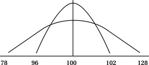
Figure 19-6 Dispersion of homogeneous and heterogeneous life satisfaction scores in two groups (see Table 19-6).
To describe a data distribution more fully, a summary measure of the variation or dispersion of the observed values is important. We discuss five basic measures of variability: range, interquartile range, sum of squares, variance, and standard deviation.
Range
The range represents the simplest measure of variation. It refers to the difference between the highest and lowest observed value in a collection of data. The range is a crude measure because it does not take into account all values of a distribution, only the lowest and highest. It does not indicate anything about the values that lie between these two extremes. In the Group 1 data listed in Table 19-6, the range is 96 to 103, or a range of 7 points. In Group 2 data, the range is 78 to 128, or a range of 50 points.
Interquartile Range
A more meaningful measure of variability is called the interquartile range (IQR). The IQR refers to the range of the middle 50% of subjects. This range describes the middle of the sample or the range of a majority of subjects. By using the range of 50% of subjects, the investigator ignores the extreme scores or outliers. Assume your study sample ranges in age from 20 to 90 years, as follows:
If you only use the range, you will report a range of 20 to 90 with a 70-point spread. However, most individuals are approximately 35 years of age. By using the IQR, you will separate the lowest 25% (ages 20, 20, and 21 years) and the highest 25% (45, 85, and 90 years) from the middle 50% (34, 35, 35, 35, 38, and 39 years). You will report the range of scores that fall within the 50th percentile. In this way you ignore the outliers of 85 and 90. Usually, when reporting the median score for a distribution, the IQR is also used. To calculate the median, you will count to the middle of the distribution. Similarly, with IQR, you will count off the top and bottom quarters.
Sum of Squares
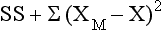
Another way to interpret variability is by squaring the difference between each score and the mean. Using squares ensures that positive and negative numbers, when added, do not cancel each other out and limit your ability to use the universe of scores that you obtain. These squared scores are then summed and referred to statistically as the sum of squares (SS). The larger the value of SS, the greater the variance. The SS is used in many other statistical manipulations. The equation for SS is as follows:
Variance
The variance (V) is another measure of variability and is calculated using the following equation:
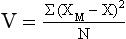
As the equation shows, variance is simply the mean or average of the sum of squares. The larger the variance, the larger is the spread of scores.
Standard Deviation
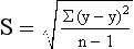
The standard deviation (SD) is the most widely used measure of dispersion. It is an indicator of the average deviation of scores around the mean or, simply, the square root of the variance. In reporting the SD, researchers often use lowercase sigma (σ) or S. Similar to the mean, SD is calculated by taking into consideration every score in a distribution. The SD is based on distances of sample scores away from the mean score and equals the square root of the mean of the squared deviations. SD is derived by computing the variation of each value from the mean, squaring the variation, and taking the square root of that calculation. The SD represents the sample estimate of the population standard deviation and is calculated by the following formula:
Examine the following calculation of the SD for these observations and a mean of 15.5 (or 16):
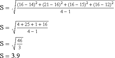
The first step is to compute deviation scores for each subject. Deviation scores refer to the difference between an individual score and the mean. Second, each deviation score is squared. As we noted earlier, if the deviation scores were added without being squared, the sum would equal zero, because the deviations above the mean always exactly balance the deviations below the mean. The standard deviation overcomes this problem by squaring each deviation score before adding. Third, the squared deviations are added; the result is divided by one less than the number of cases, and then the square root is obtained. The square root takes the index back to the original units; in other words, the standard deviation is expressed in the units that are being measured.
The standard deviation is an index of variability of scores in a data set. It tells the investigator how scores deviate on the average from the mean. For example, if two distributions have a mean of 25 but one sample has an SD of 70 and the other sample an SD of 30, we know the second sample is more homogeneous because we know that the scores more closely cluster around the mean or that there is less dispersion (Figure 19-7).
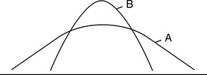
Figure 19-7 Comparison between small and large standard deviation. A, Large standard deviation. B, Small standard deviation.
Based on a normal curve, approximately 68% of the means from samples in a population will fall within one standard deviation from the mean of means, 95% will fall within two standard deviations, and 99% will fall within three standard deviations.
The mean and standard deviation are often reported together in a data table.
It is important to know the measure of central tendency for a particular variable, as well as its measure of dispersion, to understand fully the distribution that is presented.
Bivariate Descriptive Statistics
Thus far, we have discussed descriptive data reduction approaches for one variable (univariate); the procedures described are conducted for a univariate distribution. Another aspect of describing data involves looking for relationships among two or more variables. We describe two methods: contingency tables and correlational analysis.
Contingency Tables
One method for describing a relationship between two variables (bivariate relationship) is a “contingency table,” also referred to as a “cross-tabulation.” A contingency table is a two-dimensional frequency distribution that is primarily used with categorical (nominal) data. In a contingency table, the attributes of one variable are related to the attributes of another.
Returning to an earlier example, you want to know the number of male and female students for each age category of the 20 high school students registered for a drug abuse prevention program. You can easily develop a contingency table that displays the number of male and female students for each age category (Table 19-7).
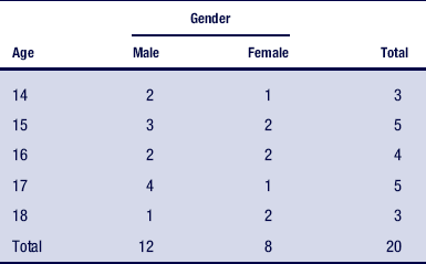
Table 19-7 shows an unequal distribution, with more male than female students registered for the course. You can add a column on the table that indicates the percentage of male and female students for each age. Also, you can use a number of statistical procedures to determine the nature of the relationships displayed in a contingency table. You can determine whether the number of male students is significantly greater than the number of female students and not a chance occurrence. These procedures are called “nonparametric statistics” and are discussed later in the chapter.
Correlational Analysis
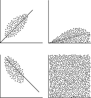
A second method of determining relationships among variables is correlational analysis. This approach examines the extent to which two variables are related to each other across a group of subjects. There are numerous correlational statistics. Selection depends primarily on the level of measurement and sample size. In a correlational statistic, an index is calculated that describes the direction and magnitude of a relationship.
Three types of directional relationships can exist among variables: positive correlation, negative correlation, and zero correlation (no correlation). A positive correlation indicates that as the numerical values of one variable increase or decrease, the values for the other variable also change in the same direction. Conversely, a negative correlation indicates that numerical values for each variable are related in an opposing direction; as the values for one variable increase, the values for the other variable decrease.
The relationship between age and height in children younger than 12 years demonstrates a positive correlation, whereas the relationship between weight and hours of exercise represents a negative correlation.
To indicate the magnitude or strength of a relationship, the value that is calculated in correlational statistics ranges from −1 to +1. This value gives you two critical pieces of information: the absolute value denoting the strength of the relationship and the sign depicting the direction. The value of −1 indicates a perfect negative correlation, and +1 signifies a perfect positive correlation. By “perfect,” we mean that the calculated values for each variable change at the same rate as another.
Assume you find a perfect positive correlation (+1) between years of education and reading level. This statistic will tell you that for each year (measured as a single unit) of education, reading level will improve 1 unit.
A zero correlation is demonstrated in Table 19-6, which displays the relationship between life satisfaction and age. The closer a correlational statistical value falls to |1| (absolute value of 1), the stronger the relationship (Figure 19-8). As the value approaches zero, the relationship weakens.
Two correlation statistics are frequently used in social science literature: the Pearson product-moment correlation, known as the Pearson r, and the Spearman rho. Both statistics yield a value between −1 and +1. The Pearson r is calculated on interval level data, whereas the Spearman rho is used with ordinal data.
To illustrate the use of the Pearson r, suppose you were interested in investigating research productivity in health and human service faculty. You examine numerous variables measured with interval-level data to determine which were related to productivity in a sample of 200 faculty members. To ascertain the extent of the relationships among selected demographic variables and publication productivity, you would conduct a series of Pearson r calculations. Assume you find that the strongest correlation (r = −0.38) existed between the hours spent in the classroom and the productivity. Note the negative association. That is to say, more hours in the classroom are related to lower productivity. The weakest correlation (r = .014) existed between desire to publish and actual publication productivity. Note that the second correlation is positive.
If you had used ordinal data in your measurements, you would have used the Spearman rho to examine these relationships.
Are these findings valuable? Could the relationships be a function of chance? Are these important in light of such seemingly low correlations? To answer these questions, the investigator must first submit the data to a test of significance, which determines the extent to which a finding occurs by chance. The investigator selects a level of significance, which is a statement of the expected degree of accuracy of the findings based on the sample size and on the convention in the relevant literature. The investigator examines a computer printout. If the computer presents an acceptable level of significance, the investigator can assume with a degree of certainty that the relationship was not caused by chance.
Consider how this statistical procedure is performed. Let us suppose that you select 0.05 as your confidence level. This number means the results will be caused by chance 5 times out of 100. If you were conducting this research before the omnipotence of computer programs, you would have located a table of critical values and found that the absolute value of your number of 0.38 exceeded the value you needed to determine that the finding was significant or not caused by chance. Therefore, you conclude that −0.38 is significant at the 0.05 level and report it to the reader as such. We mention this method because it illustrates the logic and reasoning that you need to make sense of significance. It is more likely, however, that you will conduct your analysis on a computer using statistical software. If so, you would search a computer file to determine the corresponding level of significance, calculated for the value of r = −0.38. If it was 0.05 or smaller, you would conclude that this finding was significant. As you can see, the logic is the same as calculating the value of the correlation and then looking for a critical value, but the sequence of information presented is different.
Other statistical tests of association are used with different levels of measurement. For example, investigators often calculate the point biserial statistic to examine a relationship between a nominal variable and an interval level measure. For example, this statistic might be used to examine the relationship between gender and age expressed in years. When two nominal variables such as gender and rural or urban residency are calculated, the phi correlation statistic is often selected by researchers as an appropriate technique.3 You can read about these tests and others in a text on statistical analysis.
Level 2: drawing inferences
Descriptive statistics are useful for summarizing univariate and bivariate sets of data obtained from either a population or a sample. In many experimental-type studies, however, researchers also want to determine the extent to which observations of the sample are representative of the population from which the sample was selected. Inferential statistics provide the action processes for drawing conclusions about a population, based on the data that are obtained from a sample. Remember, the purpose of testing or measuring a sample is to gather data that allow statements to be made about the characteristics of the population from which the sample has been obtained (Figure 19-9).

Statistical inference, which is based on probability theory, is the process of generalizing from samples to populations from which the samples are derived. The tools of statistics help identify valid generalizations and those that are likely to stand up under further study. Thus, the second major role of statistical analysis is to make inferences. Inferential statistics include statistical techniques for evaluating many properties of populations, such as ascertaining differences among sets of data and predicting scores on one variable by knowing about others.
Two major concepts are fundamental to understanding inferential statistics: confidence levels and confidence intervals.
Because we are now interested in making estimates and predictions about a larger group from observations drawn from a subset of that group, we cannot be certain that what we observe in our smaller group is accurate for all members of the larger group. This statement is the basis of using probability theory to guide inferential statistical analysis. By specifying a confidence level and a confidence interval, we make a prediction of the range of observations we can expect to find and how accurate we expect these to be. This set of predictions also specifies the degree of error that we are willing to accept, and it guides the researcher and consumer in the interpretation of statistical findings.
A confidence interval is defined as the range of values that we observe in our sample and for which we expect to find the value that accurately reflects the population. Consider the following example.
You are interested in predicting the percentage of inpatients on your rehabilitation unit who will use adaptive equipment after discharge. You randomly select a sample from your population of inpatients, and after surveying them for 3 months postdischarge, you find that 20% are still using their equipment. Should you expect that 20% of your population would follow the same pattern? This percentage would be your best guess, but it is derived from a subset of population members. Therefore, you need to expand your estimate to specify an interval of scores that you are confident will include the “true value” of the larger population—in this case, an interval of 15% to 30%.
However, deriving a confidence interval is only the first step. Because we are now in the world of probability, specifying a confidence interval must contain a statement about the level of uncertainty as well. This is where confidence level comes into play. A confidence level is simply the degree of certainty (or expected uncertainty) that your confidence interval is accurate for your population. So you might be 50% confident or 99% confident that your findings will be accurate. In the previous example, if you specified a confidence level of 99%, you would be 99% certain that 15% to 30% of your population would use adaptive equipment 3 months after discharge from the rehabilitation unit. The degree of assuredness, or level of confidence, that your sample values are accurate for the population is what constitutes the confidence level.
Before we discuss some of the most frequently used statistical tests and the sequence of action processes necessary to use them, consider another example.
You are a mental health provider and are interested in testing the effect of a new rehabilitation technique on the functional level of persons with schizophrenia residing in community-based group homes and attending your day program. In this study, you will evaluate the rehabilitation technique for its effectiveness on one unique group. You will also evaluate its value for the population of persons with schizophrenia residing in community-based group-home settings and attending day programs, which the sample represents. First, you will need to define your population carefully in terms of specific inclusion and exclusion criteria. You will randomly select a sample from your defined or targeted population using an appropriate random sampling technique. Next, you will randomly assign the obtained sample to either an experimental group or a control group condition. You will pretest all subjects, expose the experimental group to the intervention, and posttest all subjects. Hypothetically, the scores on your measure of functional status range from 1 to 10, with 1 the least functional and 10 the most functional. Now you have a series of scores: pretest scores from both groups and posttest scores from both groups.
Let us assign hypothetical means to each group to illustrate the point. The experimental group has a pretest mean of 2 and a posttest mean of 6, whereas the control group has a pretest mean of 3 and a posttest mean of 5. In an actual study, you would calculate measures of dispersion as well, but for instructive purposes, we will omit this measure from our discussion. To answer your research question, you must examine these scores at several levels. First, you will want to know whether the groups are equivalent before the intervention. You hypothesize that there will be no difference between the two groups before participation in the intervention. Also, you hypothesize that the groups adequately represent the population. Visual inspection of your pretest mean scores shows different scores. Is this difference occurring by chance, or as a result of actual group differences? To determine whether the difference in mean scores is caused by chance, you will select a statistical analysis (e.g., independent t-test) to compare the two sets of pretest data (e.g., experimental and control group mean scores). At this point, you will hope to find that the scores are equivalent and that therefore both sample groups represent the population.
Second, you will want to know whether the change in scores at the posttest is a function of chance or what is anticipated to occur in the population. You will therefore choose a statistical analysis to evaluate these changes. The analysis of covariance (ANCOVA) is the statistic of choice for the true-experimental design. In actuality, you will hope that the experimental group demonstrates change on the dependent or outcome variable at posttest time. You will hypothesize that the change will be greater than that which may occur in the control group and greater than the scores observed at pretest time.
Thus, as a consequence of participating in the experimental group condition, you will want to show that the sample is significantly different from the control group and thus from the population from which the sample was drawn. In actuality, you will be testing two phenomena: inference, or the extent to which the samples reflect the population at both pretest and posttest time, and significance, or the extent to which group differences are a function of chance.
As you may recall, the “population” refers to all possible members of a group as defined by the researcher (see Chapter 13). A “sample” refers to a subset of a population to which the researcher wants to generalize. The accuracy of inferences from samples to populations depends on how representative the sample is of the population. The best way to ensure “representativeness” is to use probability sampling techniques. To use an inferential statistic, you will follow the five action processes introduced in Chapter 13 and summarized in Box 19-2.
Action 1: State the Hypothesis
Stating a hypothesis is both simple and complex. In experimental-type designs that test the differences between population and sample, most researchers state a “hunch” of what they expect to occur. This statement is called a working hypothesis. For statistical analysis, however, a working hypothesis is transformed into the null hypothesis. The null hypothesis is a statement of no difference between or among groups. In some studies, the investigator hopes to accept the null hypothesis, whereas in other studies, the researcher is hoping to fail to accept the null hypothesis.
Initially, as in the example of the experimental design given earlier, we hope to accept the null hypothesis between the pretest mean scores of the experimental and control groups to ensure that our experimental and control groups are equivalent. We do not want our sample scores to differ from the population scores or the experimental and control groups to differ from one another at baseline before the introduction of the treatment intervention. We pose and test the null hypothesis and hope that in testing it, the probability at which our statistical value is significant will be unacceptable (we describe significance in detail in the next section). For our posttest and change scores, however, we hope to “reject” (formally referred to in the language of probability theory as fail to accept) the null hypothesis. We want to find differences between the posttest scores of each group and a change between pretest and posttest scores only in the experimental group. These findings will tell us that the experimental group, after being exposed to the experimental condition (the intervention), is no longer representative of the population that did not receive the intervention. In other words, the intervention appears to have produced a difference in the scores of the individuals who participated in that group.
Why is the null hypothesis used? Theoretically, it is impossible to prove a relationship among two or more variables.3 It is only possible to negate the null hypothesis of “no difference.”4 Nonsupport for the null hypothesis is similar to stating a double negative. If it is not “not raining,” it logically follows that it is raining. Applied to research, if there is no “no difference among groups,” differences among groups can be assumed, although not proven.
Action 2: Select a Significance Level
A level of significance defines how rare or unlikely the sample data must be before the researcher can fail to accept the null hypothesis. The level of significance is a cutoff point that indicates whether the samples being tested are from the same population or from a different population. It indicates how confident the researcher is that the findings regarding the sample are not attributed to chance. For example, if you select a significance level of 0.05, you are 95% confident that your statistical findings did not occur by chance. If you repeatedly draw different samples from the same population, theoretically you will find similar scores 95 out of 100 times. Similarly, a confidence level of 0.1 indicates that the findings may be caused by chance 1 of every 10 times.
As you can see, the smaller the number, the more confidence the researcher has in the findings and the more credible the results. Because of the nature of probability theory, the researcher can never be certain that the findings are 100% accurate. Significance levels are selected by the researcher on the basis of sample size, level of measurement, and conventional norms in the literature. As a general rule, the larger the sample size, the smaller the numerical value in the level of significance. If you have a small sample size, you risk obtaining a study group that is not highly representative of the population, and thus your confidence level drops. A large sample size includes more elements from the population, and thus the chances of representation and confidence of findings increase. You therefore can use a stringent level of significance (0.01 or smaller).
One-Tailed and Two-Tailed Levels of Significance
Consider the normal curve in distribution of scores (see Figure 19-4). Extreme scores can occur to either the left or the right of the bell shape. The extremes of the curve are called “tails.” If a hypothesis is nondirectional, it usually assumes that extreme scores can occur at either end of the curve or in either tail. If this is the case, the researcher will use a two-tailed test of significance. The investigator uses a test to determine whether the 5% of statistical values that are considered statistically significant are distributed between the two tails of the curve. If, on the other hand, the hypothesis is directional, the researcher will use a one-tailed test of significance. The portion of the curve in which statistical values are considered significant is in one side of the curve, either the right or the left tail. It is easier to obtain statistical significance with a one-tailed statistical test, but the researcher will run the risk of a Type I error. A two-tailed test is a more stringent statistical approach.
Type I and II Errors
Because researchers deal with probabilities in statistical inference, two types of statistical inaccuracy or error can contribute to the inability to claim full confidence in findings.
Type I Errors: In a Type I error, also called an “alpha error,”2 the researcher errs by failing to accept the null hypothesis when it is true. In other words, the researcher claims a difference between groups when, if the entire population were measured, there would be no difference. This error can occur when the most extreme members of a population are selected by chance in a sample. Assume, for example, that you set the level of significance at 0.05, indicating that 5 times out of 100 the null hypothesis can be rejected when it is accurate. Because the probability of making a Type I error is equal to the level of significance chosen by the investigator, reducing the level of significance will reduce the chances of making this type of error. Unfortunately, as the probability of making a Type I error is reduced, the potential to make another type of error increases.
Type II Errors: A Type II error, also called a “beta error,”2 occurs if the null hypothesis is mistakenly accepted when it should be not be. In other words, the researcher fails to ascertain group differences when they have occurred. If you make a Type II error, you will conclude, for example, that the intervention did not have a positive outcome on the dependent variable when it actually did. The probability of making a Type II error is not as apparent as making a Type I error.5 The likelihood of making a Type II error is based in large part on the power of the statistic to detect group differences.2
Determination and Consequences of Errors: Type I and II errors are mutually exclusive. However, as you decrease the risk of a Type I error, you increase the chances of a Type II error. Furthermore, it is difficult to determine whether either error has been made because actual population parameters are not known by the researcher. It is often considered more serious to make a Type I error because the researcher is claiming a significant relationship or outcome when there is none. Because other researchers or practitioners may act on that finding, the researcher wants to ensure against Type I errors. However, failure to recognize a positive effect from an intervention, a Type II error, can also have serious consequences for professional practice.
Action 3: Compute a Calculated Value
To test a hypothesis, the researcher must choose and calculate a statistical formula. The selection of a statistic is based on the research question, level of measurement, number of groups that the researcher is comparing, and sample size. An investigator chooses a statistic from two classifications of inferential statistics: parametric and nonparametric procedures. Both are similar in that they (1) test hypotheses, (2) involve a level of significance, (3) require a calculated value, (4) compare the calculated value against a critical value, and (5) conclude with decisions about the hypotheses.
Parametric Statistics
Parametric statistics are mathematical formulas that test hypotheses on the basis of three assumptions (Box 19-3). First, your data must be derived from a population in which the characteristic to be studied is distributed normally. Second, the variances within the groups to be studied must be homogeneous. Homogeneity is displayed by the scores in one group having approximately the same degree of variability as the scores in another group. Third, the data must be measured at the interval level.

Parametric statistics can test the extent to which numerous sample structures are reflected in the population. For example, some statistics test differences between only two groups, whereas others test differences among many groups. Some statistics test main effects (i.e., the direct effect of one variable on another), whereas other statistics have the capacity to test both main and interactive effects (i.e., the combined effects that several variables have on another variable). Furthermore, some statistical action processes test group differences only one time, whereas others test differences over time. Most researchers attempt to use parametric tests when possible because they are the most robust of the inferential statistics. By “robust,” we mean statistics that most likely detect a significant effect or increase power and decrease Type II errors.
Although we cannot present the full spectrum of parametric statistics, we examine three frequently used statistical tests to illustrate the power of parametric testing: t-test, one-way analysis of variance (ANOVA), and multiple comparisons. These techniques are used to compare two or more groups to determine whether the differences in the means of the groups are large enough to assume that the corresponding population means are different.
t-Test: The t-test is the most basic statistical procedure in this grouping. It is used to compare two sample means on one variable. Consider the following example.
You want to compare the life satisfaction level of physical therapy (PT) students with occupational therapy (OT) students. You administer a general life satisfaction scale, scored such that ascending values indicate higher levels of satisfaction, to a randomly selected sample of students and obtain a mean score for each group. Assume the OT students have an average score of 125.6 and PT students an average of 120.3. At first glance it appears the OT group has the larger mean. However, it is not much larger than the mean derived from the PT group. The statistical question follows: Are the two sample means sufficiently different to allow the researcher to conclude, with a high degree of confidence, that the population means are different from one another (even though we will never see the actual population means)?
The t-test provides an answer to this question. If the researcher finds a significant difference between the two sample means, the null hypothesis will fail to be accepted. As a test of the null hypothesis, the t value indicates the probability that the null hypothesis is correct.
Three principles influence the t-test. First, the larger the sample size, the less likely a difference between two means is a consequence of an error in sampling. Second, the larger the observed difference between two means, the less likely the difference is a consequence of a sampling error. Third, the smaller the variance, the less likely the difference between the means is also a consequence of a sampling error.
The t-test can be used only when the means of two groups are compared. For studies with more than two groups, the investigator must select other statistical procedures. Similar to all parametric statistics, t-tests must be calculated with interval level data and should be selected only if the researcher believes that the assumptions for the use of parametric statistics have not been violated. The t-test yields a t value that is reported as “t = x, p = 0.05”; x is the calculated t value, and p is the level of significance set by the researcher.
There are two types of t-tests. One type is for independent or uncorrelated data, and the other type is for dependent or correlated data. To understand the difference between these two types of t-tests, return to the example of the two-group randomized design to test an experimental intervention for patients with schizophrenia.
We stated that one of the first statistical tests performed determines whether the experimental and control group subjects differ at the first testing occasion, or pretest. The pretest data of experimental and control group subjects reflect two independent samples. A t-test for independent samples will be used to compare the difference between these two groups. However, let us assume we want to compare the pretest scores to posttest scores for only the experimental subjects. In this case, we will compare scores from the same subjects at two points in time. The scores will be more similar because they are drawn from the same sample, and pretest scores serve as a good predictor of posttest scores. In this case, the scores are drawn from the same group and are highly correlated. Therefore, the t-test for dependent data will be used, which considers the correlated nature of the data. To learn the computational procedures for the test, we refer you to statistics texts.
One-Way Analysis of Variance: The “one-way” ANOVA, or “single-factor” ANOVA, serves the same purpose as the t-test. It is designed to compare sample group means to determine whether a significant difference can be inferred in the population. However, one-way ANOVA, also referred to as the “F-test,” can manage two or more groups. It is an extension of the t-test for a two-or-more-groups situation. The null hypothesis for an ANOVA, as in the t-test, states that there is no difference between the means of two or more populations.
The procedure is also similar to the t-test. The original raw data are put into a formula to obtain a calculated value. The resulting calculated value is compared against the critical value, and the null hypothesis is not accepted if the calculated value is larger than the tabled critical value or accepted if the calculated value is less than the critical value. Computing the one-way ANOVA yields an F value that may be reported as “F(a,b) = x, p = 0.05”; x is computed F value, a is group degrees of freedom, b is sample degrees of freedom, and p is level of significance. “Degrees of freedom” refers to the “number of values, which are free to vary”3 in a data set.
There are many variations of ANOVA. Some test relationships when variables have multiple levels, and some examine complex relationships among multiple levels of variables.
You are interested in determining the effects of rehabilitation intervention, family support, and functional level on the recovery time for persons with closed head injuries. Measuring the relationship between each independent variable and the outcome will be valuable. However, it will seem prudent to consider the interactive effects of the variables on the outcome. Several variations of the ANOVA (e.g., ANCOVA) should be considered.
Multiple Comparisons: When a one-way ANOVA is used to compare three or more groups, a significant F value means that the sample data indicate that the researcher should fail to accept the null hypothesis. However, the F value, in itself, does not tell the investigator which of the group means is significantly different; it only indicates that one or more are different.
Several procedures, referred to as multiple comparisons (post hoc comparisons) are used to determine which group difference is greater than the others. These procedures are computed after the occurrence of a significant F value and are capable of identifying which group or groups differ among those being compared.
Nonparametric Statistics
Nonparametric statistics are statistical formulas used to test hypotheses when the data violate one or more of the assumptions for parametric procedures (see Box 19-3). If variance in the population is skewed or asymmetrical, if the data generated from measures are ordinal or nominal, or if the size of the sample is small, the researcher should select a nonparametric statistic.
Each of the parametric tests mentioned has a nonparametric analog. For example, the nonparametric analog of the t-test for categorical data is the chi-square. The chi-square test (χ2) is used when the data are nominal and when computation of a mean is not possible. The chi-square test is a statistical procedure that uses proportions and percentages to evaluate group differences. The test examines differences between observed frequencies and the frequencies that can be expected to occur if the categories were independent of one another. If differences are found, however, the analysis does not indicate where the significant differences are. Consider the following example.
You want to know whether 100 men and 100 women differ with regard to their views on prenatal testing for Down syndrome (in favor or not in favor). Your first step will be to develop a contingency or “cross-tab” table (a 2 × 2 table) and carry out a chi-square analysis. If there are no differences, you will expect each cell to have the same number of observations. The same number of men and women will have indicated the same views (e.g., 50 men indicate in favor, 50 men indicate not in favor; likewise, 50 women indicate in favor, and 50 women indicate not in favor). However, the actual data look somewhat different, with unequal cells. The chi-square evaluates whether differences in cells are statistically significant, that is, whether the differences are not attributable to chance, but it will not tell you where the significance lies in the table.
The Mann-Whitney U test is another powerful nonparametric test. It is similar to the t-test in that it is designed to test differences between groups, but it is used with data that are ordinal.
Suppose you now ask male and female respondents to rate their favorability toward prenatal testing for Down syndrome on a 4-point ordinal scale from “strongly favor” to “strongly disfavor.” The Mann-Whitney U would be a good choice to analyze significant differences in opinion related to gender. Many other nonparametric tests are useful as well, and you should consult other texts to learn about these techniques (see References).
For some of the nonparametric tests, the critical value may have to be larger than the computed statistical value for findings to be significant. Nonparametric statistics, as well as parametric statistics, can be used to test hypotheses from a wide variety of designs. Because nonparametric statistics are less robust than parametric tests, researchers tend not to use nonparametric tests unless they believe that the assumptions necessary for the use of parametric statistics have been violated.
Choosing a Statistical Test
The choice of statistical test is based on several considerations (Box 19-4). The answers to these questions guide the researcher to the selection of specific statistical procedures.
BOX 19-4 Questions to Consider in Choosing a Statistical Test
1. What is the research question?
2. How many variables are being tested, and what types of variables are they?
3. What is the level of measurement? (Interval level can be used with parametric procedures.)
4. What is the nature of the relationship between two or more variables being investigated?
5. How many groups are being compared?
6. What are the underlying assumptions about the distribution of a measurement in the population from which the sample was selected?
The discussion that follows of the tests frequently used by researchers should be used only as a guide. We refer you to other resources to help you select appropriate statistical techniques.6
Action 4: Obtain a Critical Value
Before the widespread use of computers, researchers located critical values in an appropriate table in the back of a statistics book. The “critical value” is a criterion related to the level of significance and tells the researcher what number must be derived from the statistical formula to have a significant finding. However, as we noted, although using the same logic, statistical software reports your findings differently. Rather than identifying your probability level and then examining the critical value you need to use as your criterion for determining significance, the computer printout will tell you at what probability your calculated value is a critical value. So rather than looking at the calculated value of your statistic, you identify significant findings by searching for levels of probability that are smaller in value than the value that you have chosen.
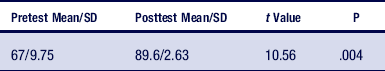
You are interested in testing the degree to which an obesity prevention program resulted in knowledge acquisition about nutrition and exercise. Table 19-8 presents a hypothetical computer-generated analysis for your inquiry. Using a pretest-posttest quasi-experimental design, you test your sample of 50 participants before the intervention on a knowledge test scored from 0 to 100, with ascending scores indicating greater knowledge. You then deliver the intervention and administer the posttest to determine the degree to which knowledge increased. To test your working hypothesis that knowledge will increase significantly, you formulate the null hypothesis of no difference between the mean pretest and posttest scores, then test it using a one-tailed t-test for dependent samples. (Remember that one-tailed tests are used if you hypothesize the direction of change, and dependent t-tests are used when the same sample generates the two data sets to be compared).
Action 5: Reject or Fail to Reject the Null Hypothesis
The final action process is the decision about whether to reject or fail to reject the null hypothesis. Thus far, we have indicated that a statistical formula is selected along with a level of significance. The formula is calculated, yielding a numerical value. How do researchers know whether to reject or fail to reject the null hypothesis based on the obtained value?
Before the use of computers, the researcher would set a significance level and calculate degrees of freedom for the sample or number of sample groups (or both). Although you will not be likely to use a printed table, again we discuss this action process here for instructive purposes. Degrees of freedom are closely related to sample size and number of groups and refer to the scores that are “free to vary.” Calculating degrees of freedom depends on the statistical formula used. By examining the degrees of freedom in a study, the researcher can closely ascertain sample size and number of comparison groups without reading anything else. In the t-test, for example, degrees of freedom are calculated only on the sample size. Group degrees of freedom are not calculated because only two groups are analyzed, and therefore only one group mean is free to vary. When degrees of freedom for sample size are calculated, the number 1 is subtracted from the total sample (DF = n − 1), indicating that all measurement values with the exception of 1 are free to vary. For the F ratio, degrees of freedom are also calculated on group means because more than two groups may be compared.
After the researcher has calculated the degrees of freedom and the statistical value, he or she locates the table that illustrates the distribution for the statistical values that were conducted. The critical values are located by observing the value that is listed at the intersection of the calculated degrees of freedom and the level of significance. If the critical value is larger than the calculated statistic, in most cases the researcher accepts the null hypothesis (i.e., no significant differences between groups). If the calculated value is larger than the critical value, the researcher rejects the null hypothesis and within the confidence level selected accepts that the groups differ.
Statistical software on the computer is capable of calculating all values and further identifying the p value at which the calculated statistical value will be significant. In the hypothetical data in Table 19-8, the means and standard deviations are presented for both pretest and posttest scores. The calculated value of t is 10.56, and the probability value at which the calculated value would be a critical value is .004. You would therefore fail to accept the null hypothesis because the probability is smaller than your selected level of .05. Therefore, using a computer to calculate statistics presents the information so that you can immediately determine whether your findings are significant simply by examining the probability values.
Level 3: associations and relationships
The third major role of statistics is the identification of relationships between variables and whether knowledge about one set of data allows the researcher to infer or predict characteristics about another set of data. These statistical tests include factor analyses, discriminant function analysis, multiple regression, and modeling techniques. The commonality among these tests is that they all seek to predict one or more outcomes from multiple variables. Some of the techniques can further identify time factors, interactive effects, and complex relationships among multiple independent and dependent variables.
To illustrate this level of statistical analysis, let us consider a hypothetical study in which you are interested in investigating predictors of outcome of marital counseling.
Given the complexity of the topic marital counseling, you have identified 22 variables from the literature that have the potential to predict outcomes on two variables: length of counseling and degree of reported improvement in the marital relationship. Included among the independent or predictor variables are the extent of investment in the counseling process on the part of the couple, degree of communication difficulty, current living arrangements of the couple, perceived equality of shared responsibility, and future expectations for success expressed by the couple. To analyze your complex data set, you choose an analysis technique called “automatic interaction detector,” a statistical procedure that can reveal predictive relationships and the strength of those relationships to examine the effect of the 22 variables on both outcomes. As you can see, predictive statistics are extremely valuable in that they suggest what might happen in one arena (outcome in counseling), based on knowledge of certain indicators (22 predictive variables).
Multiple regression is used to predict the effect of multiple independent (predictor) variables on one dependent (outcome or criterion) variable. Multiple regression can be used only when all variables are measured at the interval level. Discriminant function analysis is a similar test used with categorical or nominal dependent variables.
In the previous example of an examination of research productivity in health and human service faculty, suppose, as the basis for making decisions about tenure and promotion, you were interested in determining the predictive capacity of hours spent in the classroom, desire to publish, university support for publication, and degree of job satisfaction on publication productivity, the four variables as illustrated. Multiple regression is an equation based on correlational statistics in which each predictor variable is entered into an equation to determine how strongly it is related to the outcome variable and how much variation in the outcome variable can be predicted by each independent variable. In some cases, a stepwise multiple regression is performed in which the predictors are listed from “least related” to “most related” and the cumulative effect of variables is reported. In your study, it was found that all four predictor variables were important influences on the variance of the outcome variable.
Other techniques, such as modeling strategies, are frequently used to understand complex system relationships. Assume you are interested in determining why some persons with chronic disability live independently and others do not. With so many variables, you may choose a modeling technique that will help identify mathematical properties of relationships, allowing you to determine which factor or combination of factors will best predict success in independent living. (See the list of references for further information about these more advanced statistical techniques.)
Geospatial Analysis: GIS
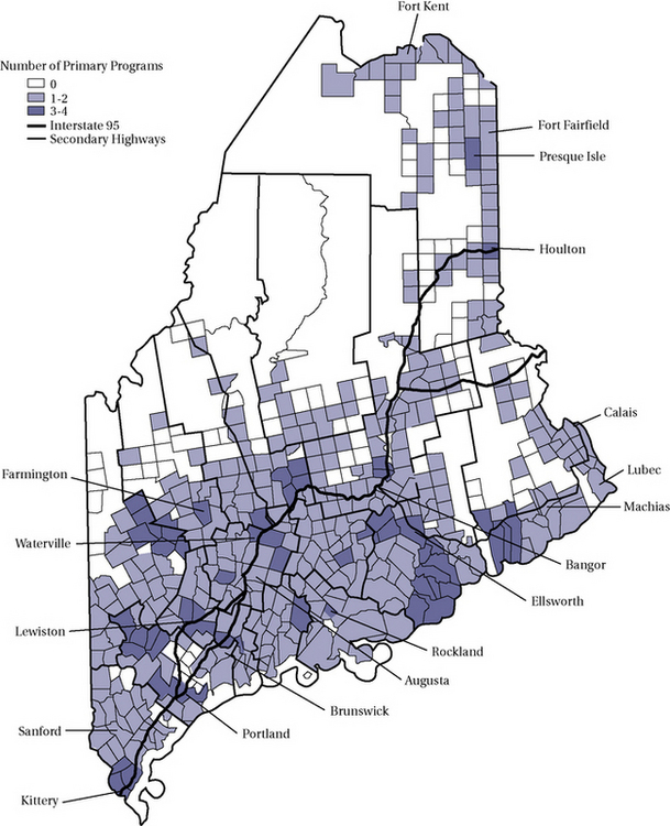
As we have presented In Chapter 15, geospatial analysis is growing in popularity. Geographic information system (GIS) is a computer-assisted action process that has the capacity to handle and analyze multiple sources of data, providing that they are relevant to spatial depiction. Remember that GIS relies on two overarching spatial paradigms, raster and vector. Raster GIS carves geography into mutually exclusive spaces and then examines the attributes of these. This type of analysis would be relevant to questions in of comparative attributes to specific locations. Vector GIS is relevant to determining characteristics of a space that is defined by points and the lines that “connect the dots.”
GIS maps are constructed from data tables, and because GIS software allows the importation of data from frequently used spreadsheets and data bases such as Excel, Access, and even SPSS, combining visual and statistical analytic techniques is relatively simple and powerful action process. We refer you to the multiple texts on GIS for specific techniques. Here consider an example. Suppose you were interested in looking at the need for health promotion and illness prevention programs in the state of Maine. Figure 19-10 depicts the density of these programs within the state. To create this visual map, the addresses of each program were entered into a database and analyzed with GIS software. The minor civil divisions are used to carve up locations into smaller areas for census procedures but do not tell you how many people live in each division. Thus, this vector approach describes the distribution of programs but cannot tell you about the relationship between population density and program density. Figure 19-11 answers that relational question by mapping two layers, population and program distribution.

Other Visual Analysis Action Processes
Mapping is only one type of visual analysis. In statistical analysis, image is primarily used to represent numeric data. Visuals such as graphs and charts have been used to display and analyze information since the inception of statistics in the mid-17th century. Similar to numeric analysis, visuals reduce data to comprehensible forms. Consider the normal curve, polygons, and bar charts. Each tells an analytic story, translating statistical analysis into an visual form. According to Tufte, “of all methods for analyzing and communicating statistical information, well-designed data graphics are usually the simplest and at the same time, the most powerful.”7
Visuals can be used for many levels of analysis, from simple univariate descriptive through multivariate prediction.
For example, Figure 9-12 depicts the gender composition of students taking an undergraduate disability studies class. Figure 19-13 is an image of the bivariate relationship between height and weight.
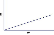
In addition to description, visual analysis is often used in intervention research. We discuss how visual data analysis can be used in case study in Chapter 23 and here provide an example.
Suppose you are interested in measuring change in a child's socialization frequency following a social skills intervention. To obtain a baseline level of socialization, you count observations per hour that the child engages with another child on the playground. You then provide the intervention and measure socialization frequency for 1 week following the intervention. Figure 19-14 presents no change since the trajectory of the line following the intervention does not change. However, if your findings are displayed in Figure 19-15, you can assume that there was a change.
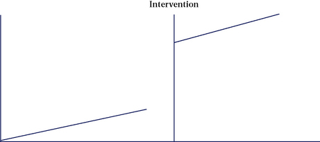
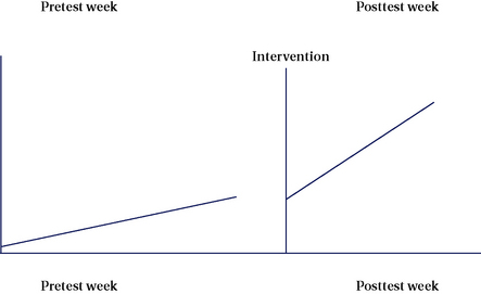
Before we leave visual analysis, we bring your attention to another area of critical use, your own inspection of data points and distributions to decide on what further statistical tests to use. Remember that we distinguished between parametric and nonparametric statistics, indicating that one of the three criteria for selection is the shape of the distribution. Visualizing the values of each variable by creating a scatterplot can quickly tell you whether your distributions are normal. Figure 19-16 presents a univariate scatterplot. Scatterplots can also be helpful in determining the nature of bivariate relationships as shown in Figure 19-17.

Finally, an example of complex, multivariate visual data analysis was presented in the previous section on GIS mapping. Of course, there are many options for visual data analysis and representation in experimental-type design. With the ubiquitous use of computers, numeric data can be transformed instantaneously into a variety of images.
Summary
Statistical analysis is an important action process in experimental-type research that occurs at the conclusion of data collection and data preparation efforts. Hundreds of statistical tests can be categorized as representing one of three levels of analysis: descriptive, inferential, or associational. The level of statistical analysis used depends on many factors, especially the research question, level of measurement of study variables, sample size, and distribution of scores. Each level of analysis builds on the other. Descriptive analyses are always conducted first, followed by inferential and associational, if the question and data warrant each subsequent form of analysis.
The decisions made in each previous step of the research process determine the specific statistical actions that will be undertaken. Thus, embedded in the investigator's research question, in the operational definitions of key concepts, and in the sampling procedures are the statistical manipulations that the investigator will be able to use.
The statistical stage of the research process represents for many researchers the most exciting action process. It is at this juncture that data become meaningful and lead to knowledge building that is descriptive, inferential, or associational. The researcher does not have to be a mathematician to appreciate and understand the logic of statistical manipulations. If the investigator does not have a strong background in mathematics, geographic analysis, or graphics, he or she should consult an expert or a statistician at the start of the study to ensure that the question and data collection methods are compatible with the statistical approaches that best answer the research question.
The purpose of this chapter is to “jump-start” your understanding of this action research process. Many guides and statistical books and resources describe in detail the hundreds of tests from which to choose.
References
1. Robertson, D., Williams, G. Clinical and translational science: principles of human research. New York: Academic Press, 2008.
2. Healey, J.F. The essentials of statistics: a tool for social research, ed 2. Belmont, Calif: Wadsworth, 2009.
3. Wasserman, L. All of nonparametric statistics. New York: Springer, 2007.
4. Spiegel, M., Schiller, J., Srinivasan, R.A. Schaum's outline of probability statistics, ed 3. New York: McGraw-Hill, 2008.
5. Huck, S.W. Reading statistics and research, ed 5. Philadelphia: Allyn and Bacon, 2007.
6. Andrews, F.M., Klem, L, Davidson, TN, et al. A guide for selecting statistical techniques for analyzing social science data, ed 2. Ann Arbor: University of Michigan, 1981.
7. Tufte, E.R. The visual display of quantitative information. Chesire, Connecticut: Graphics Press, 1986;9.